Checkbox
Checkboxes allow users to select one or more items from a predefined list of independent options.
Best practices
- When a user selects one or multiple options from a predefined list
- For accepting terms of service and similar functionality
- With clear error messaging in case of validation errors
- With proper guidelines listed below
- If the button navigates you to a new page, use one of our link components
- If the option selection affects the state of other checkboxes, use the radio button instead
- If the selection options are binary, like on/off, consider using toggle switches
- If there are more than five options, consider using the multi-select dropdown
Variations
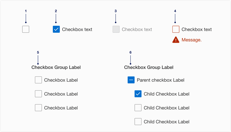
| # | Variation | Usage |
|---|---|---|
| 1 | Without Label | Checkbox without a label could be used by following and implementing appropriate accessible guidelines and techniques. |
| 2 | With Label | Checkbox should always have a short, clear and descriptive label that explains its purpose. |
| 3 | Disabled | Limit the use of disabled elements as they are not interactive and cannot be focused by keyboard. Disabled element provide visual indicator, but they don’t need to meet color contrast standards. |
| 4 | With Error Message | Checkbox shows an error message of a selection is needed to move forward. Havin clear messaging to the user is very important for them to know how to correct the error. |
| 5 | Grouped | Checkbox group is used when a user needs to select one or more options from a set of options, like selecting toppings for pizza. |
| 6 | Indeterminate Group | Checkbox grouped together where child checkbox is depended on default checkbox. Default checkbox changes to selected if all child are selected, indeterminate if some child checkbox is selected. |
Recommendations
Labels should be short, clear and descriptive. It should be easy for the user to understand what they are selecting.
Avoiding ending labels in punctuation, commas, or semicolons.
Wrap long labels below the label so the control and label are top aligned. Avoid wrapping below the control or adding ellipsis.
Choose checkbox if you want the ability to select multiple options. Use a radio button when a user is required to make only 1 selection.
Checkboxes listed vertically are easier to consume then those listed horizontally. If you use horizontal layout, limit the number of options to three across.
For vertical layout limit the vertical options to five. Consider using multi select dropdown when there are many options to select from.
Checkbox conveys selection of one or multiple items. If boolean (on/off) state is required consider using toggle switch.
Avoid adding error per item, instead add it to the group.
Responsive
When the label is too long for horizontal space, it wraps to another line below the text.
On smaller breakpoint the horizontal list will reflow into vertical list to fit the viewport. Minimum screen size to design for is 320px.
Questions?
Connect with the DLS Team on Slack or by email.
Resources
Check out additional resources.