Pagination
Pagination allows users to navigate through a large set of data, such as tables, filtered lists or search results across multiple pages. Pagination helps users to find the information they need without overwhelming them with too much content at once.
On this page
Best Practices
- To navigate between content which is split across multiple pages
- To help the user maintain a sense of position by displaying the current page numbered
- To allow the user to feel more in control of the content view
- To enhance the scalability and performance of the system by handling large amounts of data efficiently
- As infinite scroll within an experience
- As a controller to switch between multiple views. Use Tabs instead.
- As a switch between slides or content in a carousel
- As a stand alone component. Always supported with content
Variations
| Variation | Description |
|---|---|
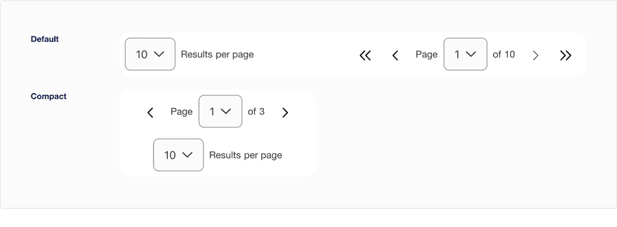
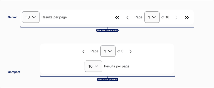
| Default | Use default variation when the container is 568 - 1440px and cannot be implemented in minimum breakpoint. |
| Compact | Use compact variation when the container is 288 - 567px and it can be implemented in all screen sizes. If results per page is visible in default be sure to have it visible in compact for consistent experience. Note: Due to space constrain, the First page and Last page buttons are removed from the pagination control. |
Recommendations
Pagination
Pagination is a control that allows the user to easily move between pages, tables or content that it’s supporting within the page layout.
- Position pagination in the same place on each page or table
- Use a single pagination component per content or table
- Use a single pagination component per content or table
Use before and after chevron buttons
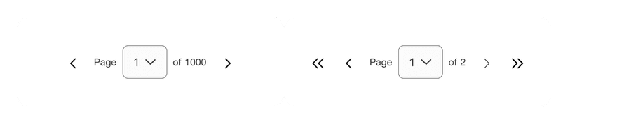
If the user is on the first page it will automatically disable first and previous page chevrons, and same goes for the last page.
Using pagination control
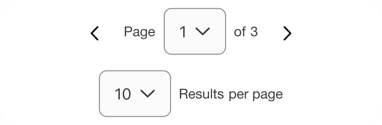
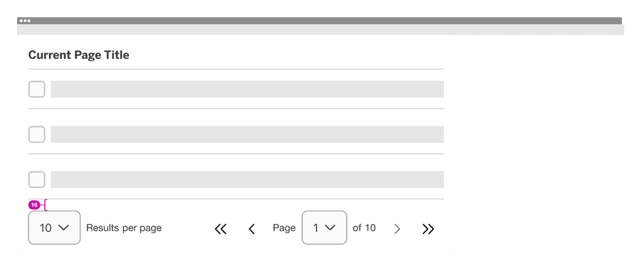
We recommend using compact variation when the user wants to have a simpler functionality. Note that the total number of pages can be limited due to minimum width of 320px.

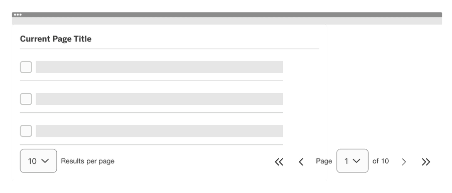
Avoid using default variation in minimum breakpoint as it does not fit the minimum requirement. See example below.
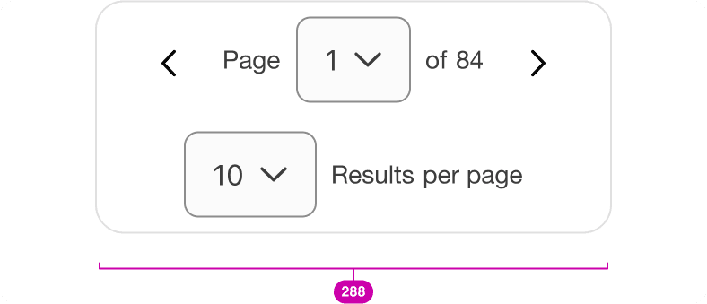

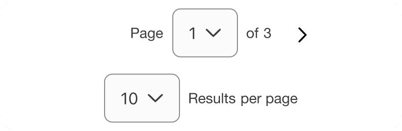
Compact variation has first page and last page button removed and limited number of total pages to ensure the component is responsive to fit the minimum of 288px. Reflow accessibility standard
Descriptive Label
Ensure you use a descriptive label or commonly recognized label so users can anticipate what types of content will be displayed.


Layout
Here are examples of how to use pagination on a page.
- The pagination should be filled to the container of the content it’s supporting.
- The width of the pagination will be controlled by the content it’s supporting.
- Make sure there’s enough distance and breathing room between the pagination and unrelated content (e.g. another section below it), so it’s clear what content the pagination is paired with.
- When pairing the pagination with your content, we recommend leaving 16px of vertical space between the pagination and the content it’s supporting.
- When using pagination without the container please follow vertical spacing from your page, to maintain consistency in the layout.
Pagination needs to ensure that the sequence is meaningful. The order of content in the sequence cannot be changed without affecting its meaning. Information, structure, and relationships conveyed through presentation can be programmatically determined to ensures that important information will be perceivable to all. Adaptable accessibility guidelines
Responsive
Pagination will wrap to a new line on minimum breakpoint automatically from default to compact variation.
All pages must be responsive and reflow to a minimum of 320px. Pagination component will reflow to a minimum of 288px, to allow for margins and grid gutters.
Questions?
Connect with the DLS Team on Slack or by email.
Resources
Check out additional resources.