Pagination
Pagination allows users to navigate through a large set of data, such as tables, filtered lists or search results across multiple pages. Pagination helps users to find the information they need without overwhelming them with too much content at once.
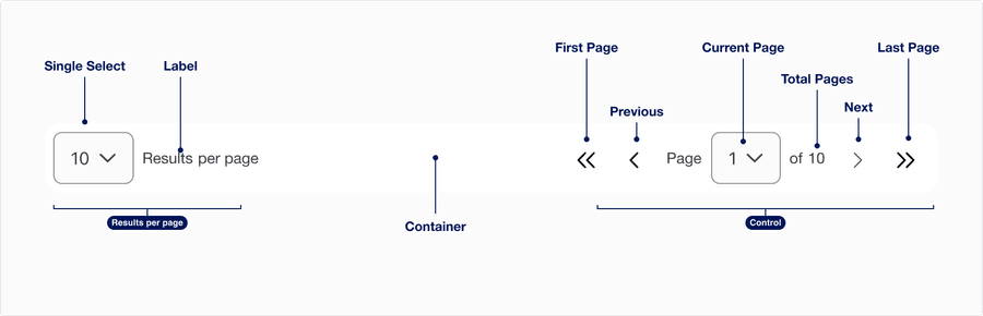
Anatomy
| Variation | Description | Required |
|---|---|---|
| Results per page | Single Select allows the user to determine the number of items per page. The default values are 10, 25, 50, and 100. Label can be edited to describe the content divided by page, such as rows, images, or transactions per page. Label must be visible when used with Single Select. | Optional |
| Container | Pagination container allows users to display component. Container max is 1440 x 64px with the option to flex. When provided container is not used follow vertical spacing of the page layout. | Optional |
| Control | A pagination control has two variations compact where it can be used for all breakpoints and default where it cannot be used in minimum breakpoint. The control consists of the action buttons, current page and total number of pages. | Yes |
| First page | This button allows the user to jump back to the first page. The button is disabled on the first page. | Optional |
| Previous | This button allows the user to go back to the previous page. The button is disabled on the first page. | Yes |
| Next | This button takes the user to the next page. The button is disabled on the last page. | Yes |
| Last page | This button allows the user to jump to the last page. The button is disabled on the last page. | Optional |
| Current page | A select showing what page the user is viewing, which can also be used for navigation | Yes |
| Total pages | Shows the number of pages based on the capacity of items per page | Yes |
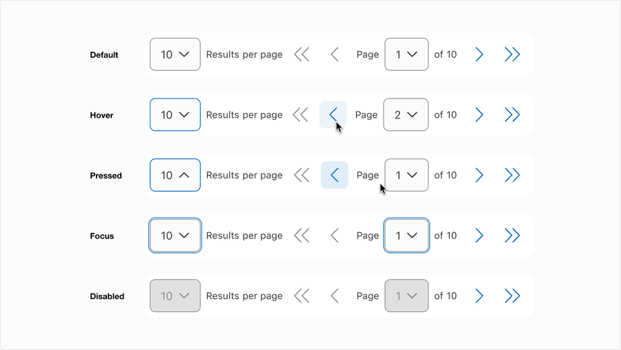
States
| Variation | Description |
|---|---|
| Default | User can select the number of results per page from the dropdown. And in the control section, the user can navigate back and forth or input a page number. |
| Hover | Control elevation and border color change indicates to a user that the option is clickable. |
| Pressed | Control elevation and border color change indicates to a user that the option is being pressed. |
| Focus | A focus outline appears around visual element to help users identify current selected component. This is used when a user navigates using keyboard controls or uses a cursor. |
| Disabled | Only use disabled when the filtered content has fewer results or only displays one page. |
Questions?
Connect with the DLS Team on Slack or by email.
Resources
Check out additional resources.