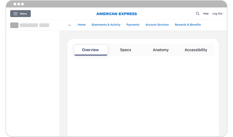
Navigational Tabs
Navigational Tabs group related pages or sections within the same product. Selecting a tab loads a new page or URL route, while keeping users within the overall navigation experience.
Best Practices
Use Navigational Tabs
- When content is part of a larger app or page structure and switching tabs routes to a new view or URL
- To represent persistent destinations that remain visible and accessible in a consistent location
- To direct user to emails or phone numbers, like DLS@aexp.com
- To help users navigate between related, parallel sections within the same overall experience
- When tabs are placed within a consistent layout or hierarchy, especially if desktop or tablet contexts
- When tab labels are concise (1–2 words), scannable, and clearly communicate the destination
- If switching between them doesn’t require saving form data or confirming unsaved changes
Don’t use Navigational Tabs
- When content toggled is part of the same screen and does not require navigation; use Segmented Control instead
- If users need to interact with content while switching; use Menus or Filters instead
- When there are too many tabs to fit comfortably; consider Vertical Navigation, Menu, or Overflow Menu
- If tab labels require long descriptions to be clear
- When tab navigation would create deep hierarchies or nesting; restructure to avoid complexity
- If switching between them could cause unexpected data loss (unsaved work); add a confirmation step or use a different navigation pattern
Variations
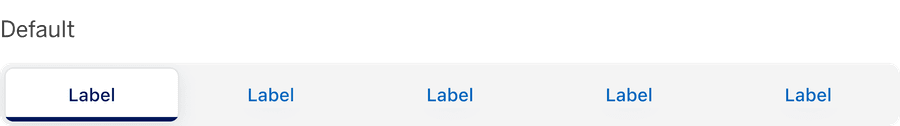
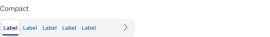
Recommendations
Labels
Do this
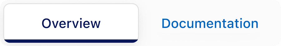
- Use clear, concise text that reflects the destination
- Keep labels short and scannable (ideally 1-2 words, ~17 characters)
- Make labels descriptive enough so users understand what content the Navigational Tab will load
- Maintain consistent terminology with the page titles or headings they link to
Don’t do this
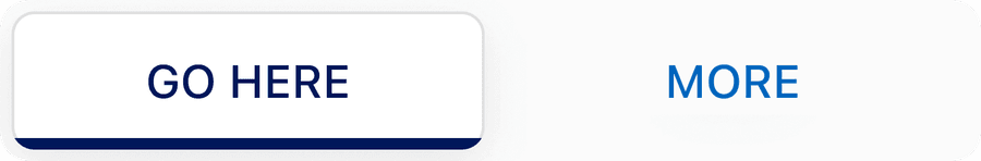
- Use vague labels like “Click Here” or “Learn More” that fail to communicate the destination or purpose of the tab
- Use placeholder or generic text
- Use all caps, this reduces readability
- Make labels so long they truncate; if more words are needed use another component
- Create labels that are inconsistent with page headings or routes, as this can confuse users
Why can't I remove the label
Removing the label from the Navigational Tabs violates WCAG 1.3.1 - Info and Relationships and WCAG 4.1.2 - Name, Role, Value, resulting in inaccessible experiences for assistive tech users. Never rely solely on visual design or color alone to convey purpose of a Tab. Without a visible or programmatically associated label, screen readers cannot announce the correct name or role of the tab, leaving users unsure of its purpose of destination.
Layout
Do this
- Center-align tabs within their container to maintain consistent visual balance across the interface
- Maintain consistent spacing and passing so tabs feels visually balanced and aligned across breakpoints
- Keep active tab indicator centered directly beneath the label to reinforce clarity and focus
Don’t do this
- Offset or stagger tab positions; as misalignment breaks visual rhythm
- Truncate lables so that meaning is lose; use shorter, clearer labels
- Modify tabs to collapse unevenly or shift alignment at different breakpoints
Similar Components
| Component | Use When | Avoid When | Performance Note | Accessibillity |
|---|---|---|---|---|
| Segmented Control | Filtering between alternative views of similar or related content | Each view requires a unique URL or separate route | Minimal impact; limit number of segments to prevent UI overload | Uses button and role radio, keyboard arrow navigation |
| Tabs | Swap content within the same page; no route views | Sections are unrelated, require separate URLs or deep navigation | Avoid placing large volumes of content in each tab as heavy page loads impact performance | Uses semantic tab pattern, role === tab and aria selected |
| Navigational Tabs | Sections are part of the same feature / topic but rout to different views | Section requires deep hierarchies, heavy loads or duplicate primary navigation | Optimize route changes/API calls for smooth transitions | Uses links with appropriate href for routing, aria-current= page for active tab |
Questions?
Connect with the DLS Team on Slack or by email.
Resources
Check out additional resources.