Navigational Tabs
Navigational Tabs group related pages or sections within the same product. Selecting a tab loads a new page or URL route, while keeping users within the overall navigation experience.
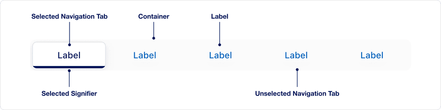
Anatomy
| State | Description | Required |
|---|---|---|
| Selected Navigation Tab | The tab that represents the current route or page in the navigation, distinguished by it’s signifier | Yes |
| Selected signifier | The visual indicator that reinforces which tab is selected | Yes |
| Container | The structural element that holds all tabs; it maintains consistent alignment, spacing and responsive behavior | Yes |
| Label | The text inside each tab that describes its destination | Yes |
| Unselected Navigation Tab | Represents any tab that is not currently active | Yes |
We use the term “Selected” (not “active”) to describe the tab that represents the current page or route in a set of navigational tabs. Using the correct terminology ensures:
- Screen readers can identify which tab is selected using aria-selected=”true”
- The selected tab matches the visible panel or route
- Focus, hover, and press states are not confused with selection states
This ensures compliance with WCAG 1.3.1 - Info and Relationships and WCAG 4.1.2 - Name, Role, Value.
States
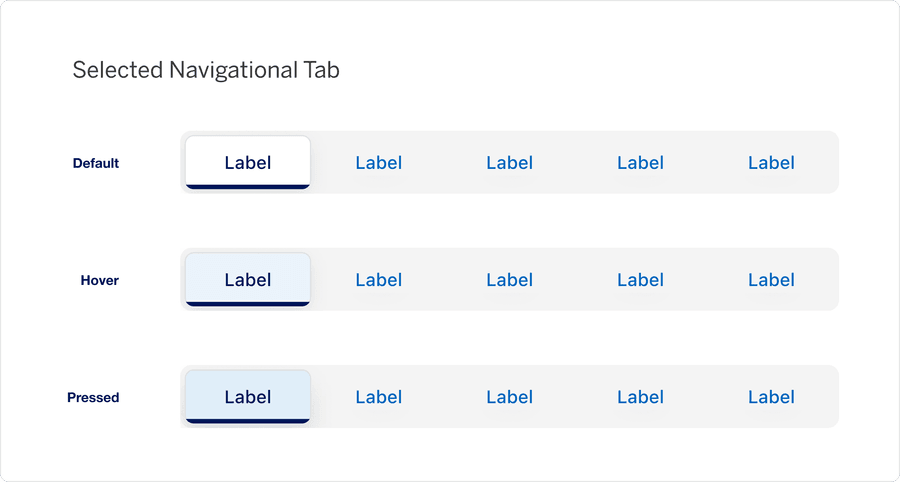
| State | Description |
|---|---|
| Default | Represents the current active route/page |
| Hover | When the pointer hovers over the selected tab, a subtle change reinforces interactivity but does not alter it’s selected state |
| Pressed | Heavy underline and chevron animation to indicate link is pressed and signify navigation. |
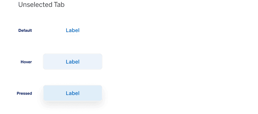
| State | Description |
|---|---|
| Default | Represents any tab that is not currently active |
| Hover | When the pointer hovers over an unselected tab, a visual change show it is interactive |
| Pressed | Indicates an unselected tab is being clicked/tapped; when activated, it will be become the selected and load the corresponding route/page |
Size
The container supports two size options: Default and Compact.
This property is designed for flexibility, allowing users to adapt the tap container to the available space or their specific layout needs. In Figma, designers may choose the size that best fits their layout.
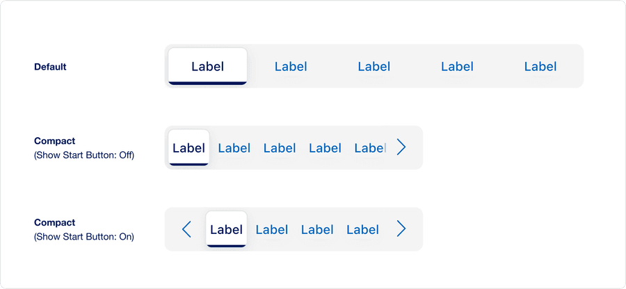
| Size | Description |
|---|---|
| Default | Provides the standard layout spacing for most used cases where reflow or limited space is not a concern |
| Compact (Show Start Button: Off) | Reduces, vertical and horizontal padding to accommodate tighter layouts, or when reflow occurs on smaller viewports |
| Compact (Show Start Button: On) | A leading Start scroll Button that allows users jump back to the first item when the container has overflow. Turn this on in Figma when you want to prototype an overflow scenario. |
- Overflow scroll buttons appear automatically when needed, they’re not tied to the size variant
- Developer don’t toggle overflow manually
- The variant prop, default or compact, can be set explicitly if a fixed layout density is desired
Questions?
Connect with the DLS Team on Slack or by email.
Resources
Check out additional resources.