Link
Use the link components for when your link is outside a paragraph. Links may be isolated, stacked vertically in a list. Links should navigate you to a new page, internally or externally, back or to further information.
Anatomy
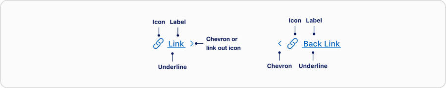
| State | Description | Required |
|---|---|---|
| Label | Concise and meaningful label to allow the user to quickly understand where the link is navigating. | Yes |
| Chevron or Link Out icon | Visual signifier that’s used along with underline on hover to indicate navigation. | Yes |
| Icon | The icon should help reinforce the sentiment behind the message. It also serves as an additional element to help support the overall meaning. | Optional |
| Underline | Appears on hover to reinforce visual signifier for link. | On Hover |
States
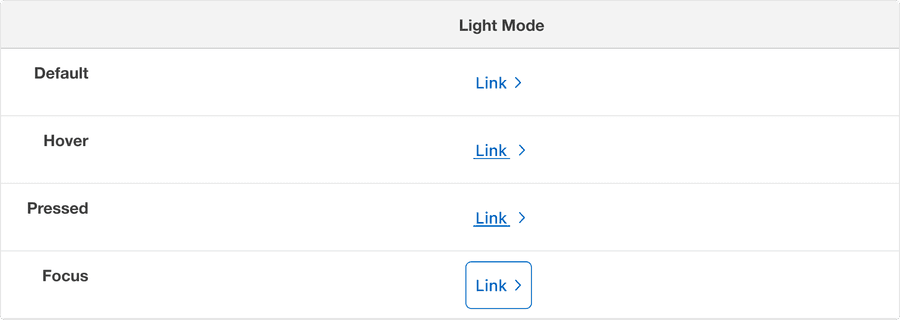
| State | Description |
|---|---|
| Default | Chevron or link out icon to signify navigation. |
| Hover | Underline and chevron animation to indicate link is hovered and signify navigation. |
| Pressed | Heavy underline and chevron animation to indicate link is pressed and signify navigation. |
| Focus | A focus outline appears around visual element to help users identify current selected component. This is used when a user navigates using keyboard controls or uses a cursor. |
Questions?
Connect with the DLS Team on Slack or by email.
Resources
Check out additional resources.