Breadcrumbs
Breadcrumbs are a secondary navigation method that show content hierarchy or traces someone’s path. They allow a user to move quickly up to a higher level or to a previous step.
Anatomy
| State | Description | Required |
|---|---|---|
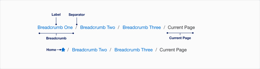
| Breadcrumb | A link to a page within the breadcrumb trail. The trail is a list of links of the parent page to the current page in hierarchical order or a list of links in the user navigation journey. | Yes |
| Label | Title of page in the breadcrumb trail | Yes |
| Separator | Provides a visual signifier of separation between each breadcrumb | Yes |
| Current Page | Name of current page and the last breadcrumb in the trail | Yes |
| Home | Home breadcrumb use for breadcrumbs that start their trail at the home page as a way to save horizontal space. Icon not editable. | Optional |
States
| State | Description |
|---|---|
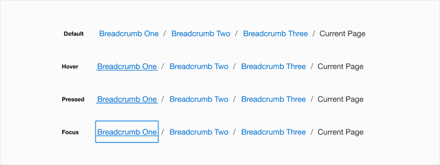
| Default | Separator and labels signify a trail of links to the current page. |
| Hover | Underline under the hovered breadcrumb to indicate link is hovered and signify navigation. |
| Pressed | Heavy underline animation under the pressed breadcrumb to indicate link is pressed and signify navigation. |
| Focus | A focus outline appears around visual element to help users identify current selected component. This is used when a user navigates using keyboard controls or uses a cursor. |
Questions?
Connect with the DLS Team on Slack or by email.
Resources
Check out additional resources.