Modals
Modals are components that take focus and overlay on top of other content on the page. Modals are used to get user attention for important notices, to request user input or decisions, and in situations where the user is required to interact before continuing. Both the modal and alert dialog components are modal dialogs: they interrupt interactions with the rest of the page, whereas non-modal dialog boxes allow users to interact with other parts of the page.
Variations
Modal
| Component | Description |
|---|---|
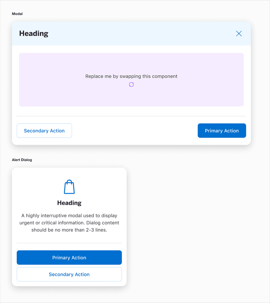
| Modal | Use this size for applications that are larger than mobile. This mode utilizes ample screen real-estate. This variant has a fixed width of 800 and can be used on viewports greater than 832. |
| Alert Dialog | A highly interruptive modal used to display urgent or critical information or require immediate user action. It’s primarily for critical alerts, confirmations, or error messages and can disable interaction with the entire interface unless resolved. |
Recommendations
What’s the Difference Between a Default Modal and Alert Dialog?
While these components serve to capture user focus and temporary block background interaction they differ and purpose, usage, and context. Here’s how we defined them:
| Component | Guidance | Usage Examples |
|---|---|---|
| Modal | A modal designed for larger screens, such as tablets where additional screen real estate allows for more detailed or complex content. It provides users with a focused interruptive experience for tasks that require their full attention. The compact modal is optimized for mobile devices where space is limited. It prioritizes essential content and actions while maintaining usability within the constraints of a compact interface. It’s important to note that the ordering of the ButtonGroup switches on mobile, where the Primary button is on top and the Secondary button is stacked below. |
|
| Alert Dialog | Interrupting users to get confirmation on a user-triggered action that is potentially disruptive or significantly changes the user’s content and system. |
|
- Modal
- For secondary workflows that do not disrupt the primary flow when closed
- Alert Dialog
- For critical messages that require immediate attention
- Modal
- For simple, time sensitive alerts
- Alert Dialog
- For complex interactions or tasks that require input such as filling out forms
Button Label Guidelines
- Be direct and concise, typically compromising a verb or a verb and noun. For example, “Edit Cart.” In some cases, single nouns like “Views” or “Options” are acceptable.
- Use contextual labels to reflect the components context.
- Group related actions together.
- Avoid ambiguity to ensure both primary and secondary actions are crystal clear.
Label guidelines with respect to their component:
- Primary actions should always represent the most critical forward-moving action
- Secondary actions should indicate alternatives without overshadowing the primary intent
- Labels in compact modals should prioritize brevity while maintaining clarity
| Component | Button Type | Guidance |
|---|---|---|
| Modal | Primary Action |
|
| Modal | Secondary Action |
|
| Alert Dialog | Primary Action |
|
| Alert Dialog | Secondary Action |
|
Content
Use copy that is clear on its own and include actions that are directly relevant to the current dataset or view. Clear and direct actions reduce cognitive load for users. Straightforward labels support assistive technologies.
- Headline
- Clearly communicate the purpose of the modal
- Use active and specific language that reflects the action or decision required
- Body text (alert dialog)
- Use the description to provide additional context or instructions, but only if needed
- Avoid repeating the headline - the description should compliment the headline by adding value
- Primary Action Button Label
- This is the most important and prominent button
- Use actionable, user-centered verbs that clearly explain the outcome
- Secondary Action Button Label
- Use the secondary action for less critical tasks
- Headline
- Use vague or ambiguous language such as “Action Required” or “Warning”
- Make headlines overly long
- Use technical jargon or internal terminology
- Body text (alert dialog)
- Repeat the headline
- Overload the user with unnecessary details
- Use vague or generic descriptions Primary Action Button Label
- Use unclear or generic labels
- Make the call to action hard to understand
- Place secondary actions above the primary action
- Secondary Action Button Label
- Make secondary actions misleading
- Make more visually prominent that the primary action
- Overcomplicate the label
Best Practices
Alert Dialog
Due to alert dialogues portraying critical, urgent, high-priority information that requires immediate user attention, good practices are essential to avoid user frustration, minimize cognitive load, build trust and clarity, and ensure accessibility.

- To interrupt the user’s workflow for critical messages that require immediate attention (for example warnings, errors, or confirmations)
- Interrupting users to alert them of potential issues and errors; this can be user or system-generated
- When the user must acknowledge the message or take a specific action before continuing (for instance confirming data deletion or addressing an error)
- To ensure no interaction with the underlying page occurs until the alert dialog is resolved
- For non-urgent messages that don’t require immediate user action (such as passive notifications or suggestions)
- When the message can be delivered in a less disruptive way (for example an inline alert or banner)
- If the content does not justify blocking interaction with the rest of the page
- Requesting large forms of information - consider a new page instead
Modal
Modals are essential for focusing the users attention on specific tasks or decisions without navigating from the current page. They serve as a temporary purposeful layer that simplifies workflows by isolating key actions or information.

- To focus user attention on a specific task or action.
- When presenting content that benefits from being overlaid on top of the existing page (e.g., forms, additional contextual details, or tools).
- To enable users to complete secondary tasks without navigating away from the main page.
- When requiring user input or confirmation to proceed, with the flexibility to decide if the underlying page remains active or inert.
- For minor notifications or non-critical actions that can be handled inline (e.g., a toast or inline message). When the interaction can happen directly within the page without disrupting the user’s workflow.
- If the modal is too complex or overcrowded, as it can overwhelm users.
- For frequent or repeated tasks where an inline solution would be more efficient.
Responsive
| Component | Description |
|---|---|
| Modal | In Figma, after the small breakpoint, the default Modal resizes to compact modal. For engineers, the buttons re-stack. Reflow 1.4.10 accessibility standard. |
| Alert Dialog | Has a min-width of 300 and reflows to a max-width of 500. Reflow 1.4.10 accessibility standard. |
Questions?
Connect with the DLS Team on Slack or by email.
Resources
Check out additional resources.