Modals
Modals are components that take focus and overlay on top of other content on the page. Modals are used to get user attention for important notices, to request user input or decisions, and in situations where the user is required to interact before continuing. Both the modal and alert dialog components are modal dialogs: they interrupt interactions with the rest of the page, whereas non-modal dialog boxes allow users to interact with other parts of the page.
On this page
Anatomy
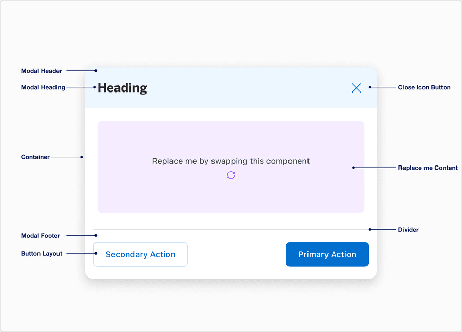
Modal
| Sub-Component | Definition | Required |
|---|---|---|
| Modal Header | Displays the title of the filter. Label best practice. | The modal header is required. The background tint is optional. |
| Modal Heading | A descriptive label for the category of the list | Optional |
| Container | Card container of the alert dialog that contains its elements. | Yes |
| Modal Footer | Footer is pinned to the bottom of the modal, often used to display actions depending on the use case. | Yes |
| Button Group | Button layout consists of 4 options: left & right split, centered; form left aligned; form right aligned | Optional |
| Close Icon Button | Provides users options to be able to close the modal | Yes |
| Replace Me Content | Once you create your content, you can insert it via component swap | Yes |
| Divider | Label divider provides users the visual separation between content and call to actions in footer | Optional |
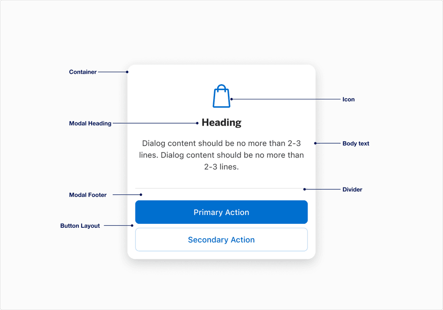
Alert Dialog
| Sub-Component | Definition | Required |
|---|---|---|
| Modal Heading | A descriptive label | Yes |
| Container | Card container of the alert dialog that contains its elements. | Yes |
| Modal Footer | Footer is pinned to the bottom of the modal for consistent usability, consistency, and accessibility. | Yes |
| Button Group | Button layout supports one layout option. Primary and secondary actions are both required. | Yes |
| Body text | Supportive text, approximately 20 characters or less. | Optional |
| Divider | Divider provides users the visual separation between content and call to actions in footer | Optional |
| Icon | Contextually relevant icon that assists user, ideally has consistent meaning across all our markets. Decorative icons must include alt text within the component configuration. | Optional |
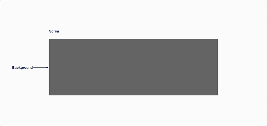
Scrim
| Component | Definition | Required |
|---|---|---|
| Background | When a Modal or Alert Dialog pops up, a scrim is used to dim the background area behind it. | Yes |
Questions?
Connect with the DLS Team on Slack or by email.
Resources
Check out additional resources.