Accordion
Accordion
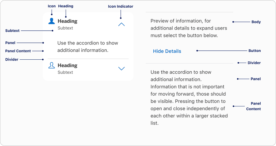
Anatomy
| Name | Description | Required |
|---|---|---|
| Heading | Accordion heading allows users to select in any area to expand or open the content | Yes |
| Panel | Hides and shows when user interacts with heading | Yes |
| Panel Content | Consist of text or custom where user has the ability to change into their local component | Yes |
| Heading | Heading should be clean and when panel opens the content should be relevant to the heading label | Yes |
| Subtext | Subtext allows the user to add additional text to support the heading if needed | Optional |
| Icon | A visual element to support the content. Icon is placed left of the heading. User can change the icons. | Optional |
| Icon Indicator | Used as a visual signifier to show active or inactive. Can be placed on the right by default, or on the far left by the icon. | Yes |
| Divider | Used for making a group of accordions. Dividers separate the accordions visually | Yes |
| Button | Button allows users to expand or open the content | Yes |
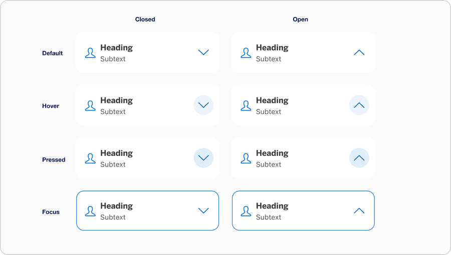
States
| State | Description |
|---|---|
| Default | Users can select any area of the container to open or expand for more content. |
| Hover | Background color change indicates a user that the option is selectable. |
| Pressed | Background color change indicates to a user that the option has been selected. |
| Focus | Focus lets the user know which element they are currently on. |
Questions?
Connect with the DLS Team on Slack or by email.
Resources
Check out additional resources.