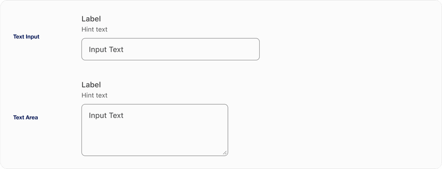
Text Input
Inputs allow users to enter text into a field. They are typically appeal in forms and dialogs.
On this page
Best Practices
- To let a user input data in a text field
- For fields that require concise answers
- If a user needs to input data to validate or move forward to the next step (mainly used in forms or applications)
- With labels and hint text (optional). Avoid using placeholder text as it’s not viewable once user interacts with the component and can make the text field appear filled out
- Showing “optional” when necessary, making it clear to the user that the field is not required to move forward
- If you expect user to input text longer than a single line, considering using text area
- Without a label as it is required from an accessibility stand point for screen readers to announce the label. It helps users know what to fill out.
- When the input is not meant to be editable (use read-only text or labels instead)
- For actions like filtering or navigating that can be achieved through buttons or toggles
Variations
| Variation | Description |
|---|---|
| Text Input | Text Input allows the user to enter a single line of text. It is commonly used in forms and other applications where the user needs to enter a small amount of text. |
| Text Area | Text Area is a text input that allows the user to input or edit multiple lines of text. It is commonly used in forms, messaging applications, and other applications where the user needs to enter a large amount of text. |
Recommendations
Content Guidelines
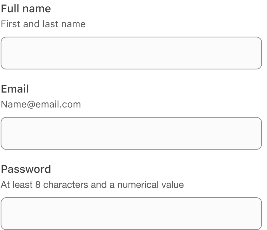
Input labels are required and should be short, clear and descriptive. It should be easy for the users to understand what they are expected to be entering.
When writing labels, use sentence case, not title case or all caps (unless you have a proper noun).
Avoid ending labels in colons or commas.
Write an error message which provides a solution to guide user on how to complete the input.
Layout
Use text input to build forms, which allows users to add data to submit application. Forms are easy to comprehend when placed in one vertical column compared to multiple columns horizontally.
When building a form, layout is very important. One column has tested positively as best practice because it is easier to read and navigate down the page even on smaller screens.
Avoid forms with multiple columns. Having two or more columns uses a z-pattern which will slow down the speed of the user to comprehend and leave them confused.
If you do use more than one column be sure the input fields are related, like address.

Avoid Placeholders
Always provide a label for input. Avoid using placeholders when possible and use hint text for as instructions on how to complete an input.
Placeholder cause usability issues:
- Placeholders may hide important information when content is entered
- Placeholders are not viewable once the user interacts with the component
- Placeholder text can make the field appear to be filled out when the user is scanning, causing them to miss inputting data into the field
- Use optional hint text to provide additional information
Using Info Tooltips
Use tooltips for providing contextual user triggered information that provide additional information for journeys. Consider using hint text on inputs before using a tooltip.
Find out more about how to use info tooltips on the tooltips documentation.
- Use tooltips to give non critical contextual information or help to users.
- Tooltip may move above, below, before, or after the trigger button, and will move depending on the trigger buttons location on screen at the time.
- Position over labels or input text
- For information that is needed to complete a task
Most interactive components need to be at least 44 by 44px to pass the minimum target size accessibility standard. Tooltip is an exception when it’s inline with a sentence or block of text, for example input label or a page title. Any tooltips not inline still need to be at least 44 by 44px to pass the minimum target size.
Required Fields
Avoid using asterisk mark for required fields, users assume all fields are required. Consider using optional to the inputs that are not required.
Use Autocomplete
Autocomplete is a HTML attribute that specifies permissions and information expected in a text field. This information is used by browsers to allow users to input saved data stored in their browser such as usernames and addresses.
When possible use autocomplete input formats to save users time when filling in forms. Read more about the HTML attribute autocomplete.
Avoid Disabled Inputs
Try to avoid using disabled Inputs when possible, opting for read only or no input and an informative alternative along with a label, such as the value currently set.
If you choose to use a disable a input, our inputs use aria-disabled=“true” instead of disabled, so the input is announced to screen reader users.
- Avoid disabled inputs when possible
- Instead of an input try using an informative plain text alternative, along with a label such as the value currently set
- Use form validation
- Use aria-disabled=“true”
- Don’t use disabled inputs labels to communicate information
Disabled inputs are visible, but not always focusable. They are not announced to screen readers using tab, and can only be found if your users go looking for them.
Responsive
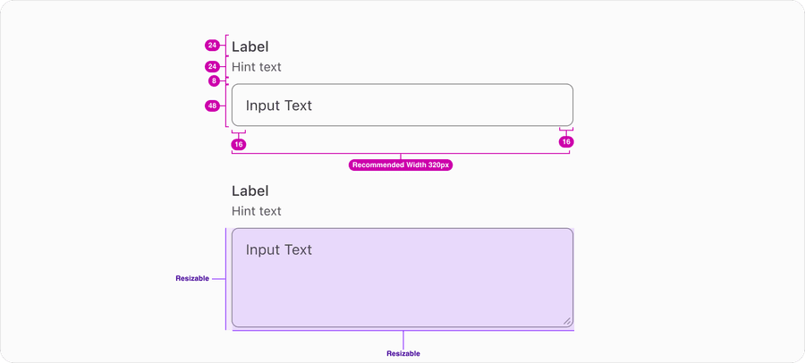
Text Inputs have a recommended 316px width with the option to fill their container and a set height of 48px. Text area by default start at 316px width with the option to fill their container and a height that fits three lines of text. Text area can be resized by the user.
All pages must be responsive and reflow to a minimum width of 320px or height of 256px without two scroll bars. 320css px supports people with low vision who need to enlarge text and read it in a single column. When the browser zoom is used to scale content to 400%, it reflows - i.e., it is presented in one column so that scrolling in more than one direction is not necessary. Reflow accessibility standard
Questions?
Connect with the DLS Team on Slack or by email.
Resources
Check out additional resources.