Text Input
Inputs allow users to enter text into a field. They are typically appeal in forms and dialogs.
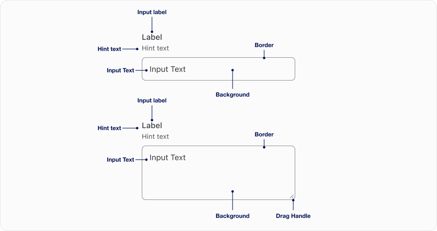
Anatomy
| Name | Description | Required |
|---|---|---|
| Input Label | A concise descriptive text that informs the users of the text fields intent. | Yes |
| Hint Text | It helps the user understand additional details about the text input requirements. | Optional |
| Border | Adds sufficient contrast to pass accessibility in pressed, success and error states. | Yes |
| Drag handle | Drag handle allows user to resize the text area. Resizing is enabled by default, but you can disable it using a resize value of “none” | Optional for text area |
| Background | Background color can convey active or disabled. | Yes |
| Input Text | Similar to hint text it is meant to provide additional queues around input requirements or format, note that placeholder is not viewable once a user interacts with input. Try using hint text first. | Yes |
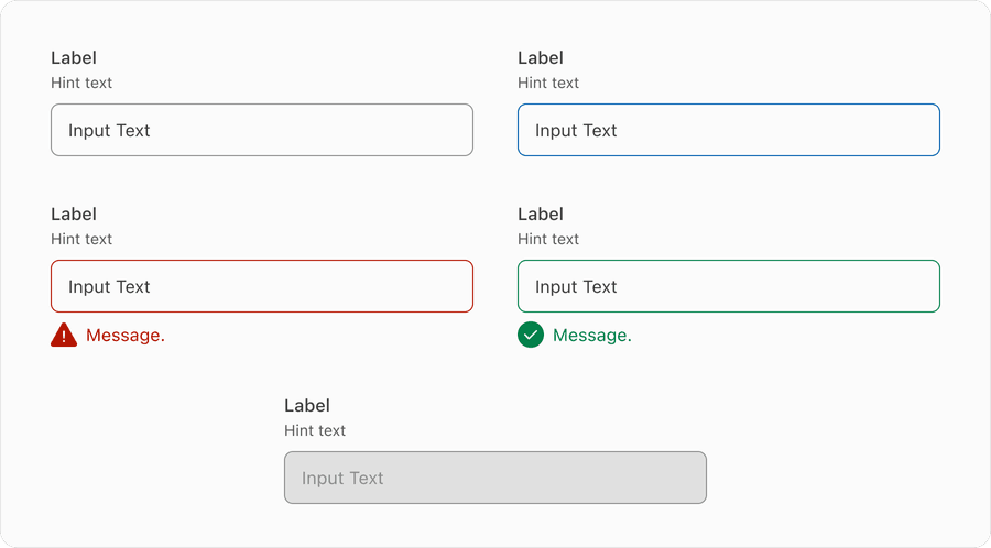
States
| Name | Description |
|---|---|
| Default | Users can tap or click the text field to input data. |
| Pressed | It helps the user understand additional details about the text input requirements. |
| Error | --- |
| Success | Help users understand that the information has been validated. This could be after having an error or successfully inputed data such as a username or Safekey code. |
| Disabled | Limit the use of disabled elements as they are not interactive and cannot be focused by keyboard. Disabled elements provide visual indicator, but they don’t need to meet color contrast standards. If an element is disabled, please follow accessibility guidelines to support assistive technology. |
Questions?
Connect with the DLS Team on Slack or by email.
Resources
Check out additional resources.