Formatted Text Inputs
Text inputs with modifiers that allow the ability to input data in a structured format.
Best Practices
- To let a user input data in a text field
- For one line use text input, for more than one line use text area.
- If a user needs to input data to validate or move forward to the next step, mainly used in forms or applications
- With labels and hint text (optional). Avoid using placeholder text as its not viewable once user interacts with the component and can make the text field appear filled out.
- Showing “optional” when necessary, making it clear to the user that the field is not required to move forward
- If you expect user to input text longer than a single line, considering using text area
- Without a label as it is required from an accessibility stand point for screen readers to announce the label. It helps users know what to fill out.
- Disable inputs when possible
Variations

| Variation | Description |
|---|---|
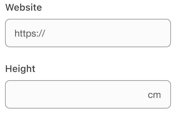
| Prefix or Suffix | Choose from either an icon or text string shown before or after content to define the format of the input. Use for currency, countries, emails with domains “@aexp.com”, or “https://” for websites. Prefix and Suffix can be:
|
| Currency | Format the correct currency for your locale. The react component formats currency based on page locale. |
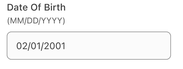
| Date | Date input uses the format labels to give users a persistent example of expected date format. The date input collects numbers for dates format based on local. |
| Password | Allows users to show or hide input content, this could be used for passwords or other sensitive data. By default password input will hide the characters as a user enters them. A user can choose to toggle on the character visibility by clicking the view icon toggle button at the end of the input field. Remember to provide detailed helper text listing any requirements related to the data format, such as types of characters allowed or date structure. |
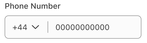
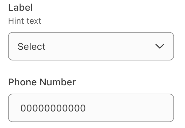
| Phone | A composite input, containing a select and input. Used to allow users to choose their country calling code, when entering a phone number. The current locals calling code should be chosen by default. |
Recommendations
Input labels are required and should be short, clear and descriptive. It should be easy for the users to understand what they are expected to be entering.
Input Labels
Input labels are required and should be short, clear and descriptive. It should be easy for the users to understand what they are expected to be entering. For more details on
- Avoid ending labels in colons or commas
- Write an error message which provides a solution to guide user on how to complete the input
- Show “optional” when necessary, making it clear to the user that the field is not required to move forward
- Remove input labels
- Use colons at the end of labels
Avoid Placeholders
Always provide a label for input. Avoid using placeholders when possible and use hint text for as instructions on how to complete an input.


Placeholder cause usability issues:
- Placeholders may hide important information when content is entered. Placeholders are not viewable once the user interacts with the component.
- Placeholder text can make the field appear to be filled out when the user is scanning, causing them to miss inputting data into the field.
Use optional hint text to provide additional information.
Choosing Icons
Icons used within inputs should be simple, with well known visual metaphors, such as our star badge for reward points or a pencil for edit.
- Use simple well known icons for example close and edit
- Take real world examples for example pencil for edit
- Be consistent. Always use the same icon for action.
- Think customer consistency. Follow the icon names available in our icon library for the actions when possible.
- Consider icon meaning and localization
- Use different icons for the same action
- Use the same icon for different actions
- Use complex icons
- Icons need to be simple and easy to understand.
- For accessibility, we need to make sure we use icons for the same meaning throughout our website. Consistent identification accessibility standards
- Remember: the more complex the icon, the longer a user spends understanding them.
When to use prefix or suffix
Use a prefix or suffix for inputs where users need to fill content with a predictable beginning or end.

Formatting Dates
Date formats change depending on market, country, or regions. For example canada is officially bilingual, with both English and French as its official languages. In English-speaking regions, the most common date format is month-day-year, while in French-speaking regions, the day-month-year format is more commonly used. Find out more about formatting date in the internationalization documentation.
To accurately localize date formatting for different locales, make sure that all content containing the date and time references are not hardcoded and reference APIs for automatic formatting.

Formatting Date of Birth
Use date inputs for date of birth, with the correct locale format.
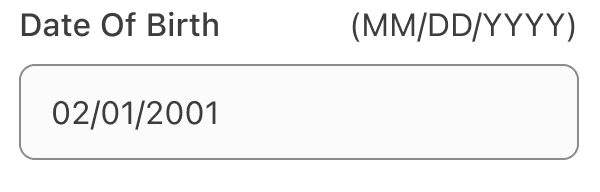
- Forward slashes or hyphens (depending on choice of market) are auto populated (or ignored if user types them) and cursor proceeds thru available character spaces.
- With the un-bolded ‘input format’ (MM/DD/YYYY), adjust the order to meet the need of the market. Example: In Japan the order changes to: “(YYYY/MM/DD)”.
- For accessibility, use a screen reader class to announce non-verbose instructions such as “Enter two numbers for the day, two numbers for the month, and 4 numbers for the year of your birth”.
- If separate inputs are required by a market.
- Without a label or the ‘input format’, as it is required for accessibility guidance stand point for screen readers to announce the label and instructions. It helps users know what to fill out.
When to Use Phone Input
Phone number formats vary widely around the globe. Use phone inputs for collecting phone numbers where you cannot predict users locale or region, for example booking.
Localization
Markets and the countries they are in use different currency, phone number formats and address formatting. Here are some reference tables, for those formats, if you would like to read more about localization read the internationalization documentation.
Currency
In many European markets, such as France, Germany, and Scandinavian countries, the currency symbol sits to the right of the currency amount. In other markets, such as the U.S., the symbol sits to the left of the amount. The formatting currency table in the internationalization documentation to check you markets currency placement.
dls.js handles the currency format and symbol alignments of the component. If you are not using dls.js, you should use the built-in JavaScript Number function toLocaleString or equivalent to handle formatting and alignment.
Country Calling Codes
Phone number formats vary widely around the globe. For example, phone numbers in the US are 10 digits, including area code. However, in Hong Kong, there are no area codes and phone numbers are 8 digits. With this in mind, input masking must be implemented with care, or not used at all. As an alternative, you can use formatting.
Input masks automatically format the data provided by customers as they type. Customers only need to enter numbers, not characters like parenthesis or dashes. The field has a numbers-only constraint to prevent validation errors. Formatting takes the input data and formats it automatically to custom specifications.
To ensure input masks work correctly, they need to be localized to the customer’s region, which means that the default implementation for all customers is a standard empty form field that accepts any formatting.
Do not repurpose input masks for other regions without first researching, testing, and verifying that region’s data formatting. For markets with multiple formats, the input mask should use logic to update formatting after each key press.
| Country | Locale | Country Code | Country Calling Code |
|---|---|---|---|
| Argentina | es-AR | ARS | 54 |
| Australia | en-AU | AUD | 61 |
| Brazil | pt-BR | BRL | 55 |
| Canada | en-CA | CAD | 1 |
| Canada | fr-CA | CAD | 1 |
| Denmark | da-DK | DKK | 45 |
| Germany | de-DE | EUR | 49 |
| Hong Kong | zh-HK | HKD | 852 |
| Hong Kong | en-HK | HKD | 852 |
| India | en-IN | INR | 91 |
| Japan | ja-JP | JPY | 81 |
| Finland | sv-FI | EUR | 358 |
| Finland | fi-FI | EUR | 358 |
| Malaysia | ms-MY | MYR | 60 |
| Netherlands | nl-NL | EUR | 31 |
| Philippines | en-PH | PHP | 63 |
| Singapore | en-SG | SGD | 65 |
| Spain | es-ES | EUR | 34 |
| Sweden | sv-SE | SEK | 46 |
| United Kingdom | en-GB | GBP | 44 |
| United States | en-US | USD | 1 |
Postal Code Formatting
Addresses and postal codes formats vary widely around the globe. For example, zip codes in the US are 5 or 9 digits. However, Canada is a 6 alphanumeric in pattern “A1A1A1”.
| Country/Region | Format |
|---|---|
| Australia | 4 numbers |
| Austria | 4 numbers |
| Canada | 6 alphanumeric in pattern A1A1A1 |
| Finland | 5 numbers |
| France | 5 numbers |
| Germany | 3 numbers |
| India | 6 numbers |
| Mexico | 5 numbers |
| Netherlands | 4 numbers, space, 2 letters (e.g. 1234 AB) |
| Singapore | 6 numbers |
| Spain | 10 numbers |
| Sweden | 3 numbers, space, 2 numbers (e.g. 123 45) |
| New Zealand | 4 numbers |
| Taiwan | 6 numbers |
| United States | 5 or 9 numbers (e.g. 12345-6789). Customer has the option to enter hyphen into input field for nine-digit number; if nine-digit number is entered without hyphen or with a space, the component will add hyphen to meet downstream service formatting standards. |
| United States Armed Forces: APO/FPO/AA | 1st digit: 3, 2nd digit: 4, 3rd digit: 0, 4th-9th digit: any number |
| United States Armed Forces: APO/FPO/AE | 1st digit: 0, 2nd digit: 9, 3rd digit: 0-8, 4th-9th digit: any number |
| United States Armed Forces: APO/FPO/AP | 1st digit: 9, 2nd digit: 6, 3rd digit: 2-6, 4th-9th digit: any number; US Corp: 5 numbers |
Questions?
Connect with the DLS Team on Slack or by email.
Resources
Check out additional resources.