Formatted Text Inputs
Text inputs with modifiers that allow the ability to input data in a structured format.
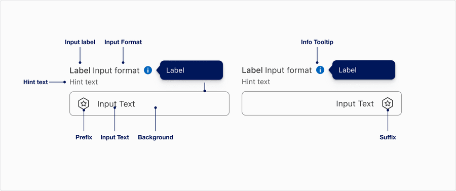
Anatomy
Prefix or Suffix
| Name | Description | Required |
|---|---|---|
| Input Label | Concise descriptive text that informs the users of the text fields intent. | Yes |
| Input Format | Use to guide users in entering data in a specific format, such as a date, time, phone number, or currency value. This can help to reduce errors and improve data accuracy, as well as enhance the user experience by making it easier to enter data correctly. | Optional |
| Hint Text | Helps the user understand additional details about the text input requirements. | Optional |
| Border | Adds sufficient contrast to pass accessibility in pressed, success and error states. | Yes |
| Prefix | Fixed text or icon that is placed before an input field to provide additional context or information about the data that should be entered. | Optional |
| Input Text | Text that a user enters into an input field. | Yes |
| Suffix | Fixed text or symbol that is placed after an input field to provide additional context or information about the data that should be entered. | Optional |
| Info Tooltip | Info tooltip is triggered by Icon toggle button with the info icon. Info tooltip can only be used inline. Use info tooltip to give users extra information that is contextual but not critical to a user’s journey. Here’s the full tooltip documentation. | Optional |
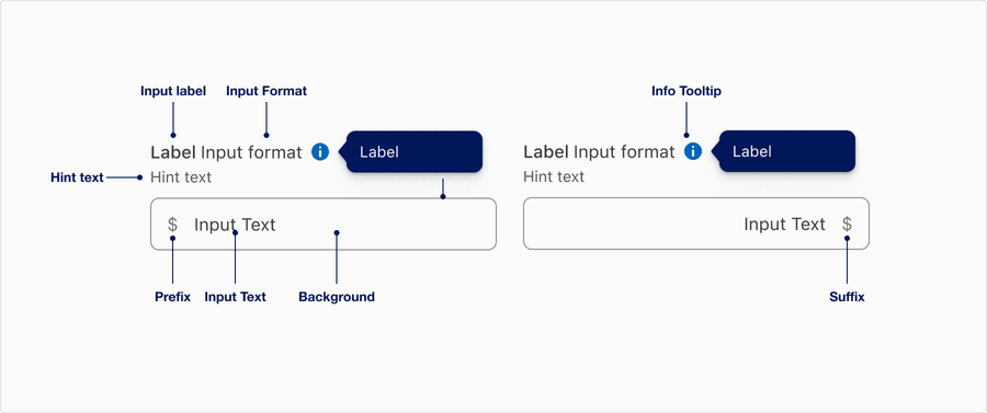
Currency
| Name | Description | Required |
|---|---|---|
| Input Label | Concise descriptive text that informs the users of the text fields intent. | Yes |
| Input Format | Use to guide users in entering data in a specific format, such as a date, time, phone number, or currency value. This can help to reduce errors and improve data accuracy, as well as enhance the user experience by making it easier to enter data correctly. | Optional |
| Hint Text | Helps the user understand additional details about the text input requirements. | Optional |
| Border | Adds sufficient contrast to pass accessibility in pressed, success and error states. | Yes |
| Prefix | Currency symbol based on local that is placed before an input field to provide additional context or information about the data that should be entered. | Optional |
| Input Text | Text that a user enters into an input field. | Yes |
| Suffix | Currency symbol based on local that is placed after an input field to provide additional context or information about the data that should be entered. | Optional |
| Info Tooltip | Info tooltip is triggered by Icon toggle button with the info icon. Info tooltip can only be used inline. Use info tooltip to give users extra information that is contextual but not critical to a user’s journey. Here’s the full tooltip documentation. | Optional |
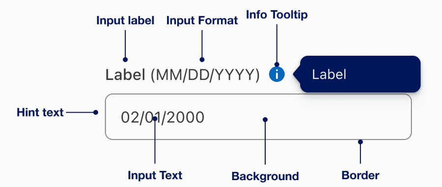
Date
| Name | Description | Required |
|---|---|---|
| Input Label | Concise descriptive text that informs the users of the text fields intent. | Yes |
| Input Format | Use to guide users in entering data in a specific format, such as a date, time, phone number, or currency value. This can help to reduce errors and improve data accuracy, as well as enhance the user experience by making it easier to enter data correctly. | Optional |
| Hint Text | Helps the user understand additional details about the text input requirements. | Optional |
| Border | Adds sufficient contrast to pass accessibility in pressed, success and error states. | Yes |
| Input Text | Text that a user enters into an input field. | Yes |
| Info Tooltip | Info tooltip is triggered by Icon toggle button with the info icon. Info tooltip can only be used inline. Use info tooltip to give users extra information that is contextual but not critical to a user’s journey. Here’s the full tooltip documentation. | Optional |
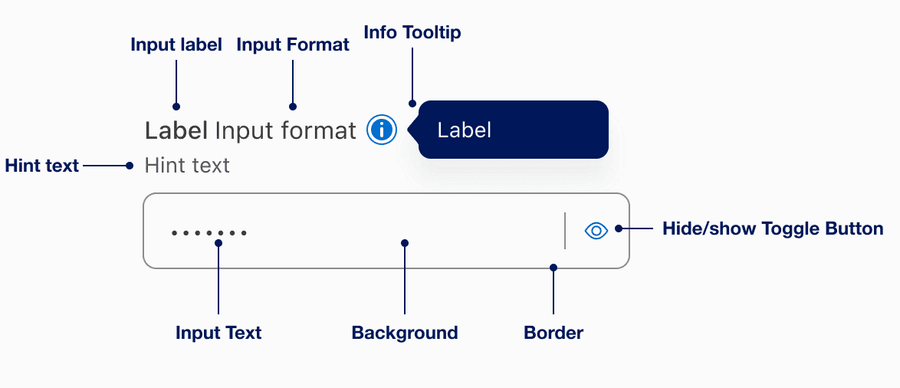
Password
| Name | Description | Required |
|---|---|---|
| Input Label | Concise descriptive text that informs the users of the text fields intent. | Yes |
| Input Format | Use to guide users in entering data in a specific format, such as a date, time, phone number, or currency value. This can help to reduce errors and improve data accuracy, as well as enhance the user experience by making it easier to enter data correctly. | Optional |
| Hint Text | Helps the user understand additional details about the text input requirements. | Optional |
| Border | Adds sufficient contrast to pass accessibility in pressed, success and error states. | Yes |
| Input Text | Text that a user enters into an input field. | Yes |
| Info Tooltip | Info tooltip is triggered by Icon toggle button with the info icon. Info tooltip can only be used inline. Use info tooltip to give users extra information that is contextual but not critical to a user’s journey. Here’s the full tooltip documentation. | Optional |
| Hide/Show Toggle Button | Allows the user to toggle the visibility of an input field. User can choose to show or hide the characters they are typing, this enhances the security of sensitive information by allowing the user to hide it from view, while also providing the option to show it if needed. | Yes |
States
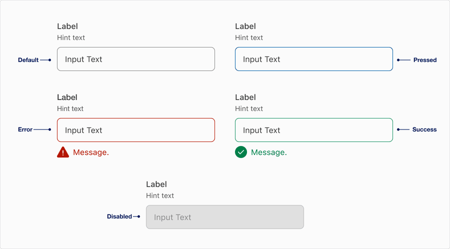
| State | Description |
|---|---|
| Default | Users can tap or click the text field to input data. |
| Pressed | A change in border color to indicate its pressed and ready for user to interact. |
| Error | Help users understand that there is an error if a field is not validated in a particular format or left blank. Providing a clear message to the user is important for them to know how to correct the error. |
| Success | Help users understand that the information has been validated after having an error. |
| Disabled | Limit the use of disabled elements as they are not interactive and cannot be focused by keyboard. Disabled elements provide visual indicator, but they don’t need to meet color contrast standards. If an element is disabled, please follow accessibility guidelines to support assistive technology. |
Questions?
Connect with the DLS Team on Slack or by email.
Resources
Check out additional resources.