Segmented Control
Segmented control are used to switch between alternative views of similar or related content.
On this page
Best Practices
Use Segmented Control
- To perform an action
- Only if a user has two to five options to select from
- To select an option or to switch between similar or related content within the page. An example would be toggling between alternate views of data using table, bar chart or line chart
- To sort or filter similar or related data by selecting an option for example star rating or nearest location of coffee shops
Don't Use Segmented Control
- To display different, unrelated content within a page when a user selects an option, consider using tabs
- If you need to have more than five selections, consider using a menu
- With only one selection, it needs two or more
- If you need to have multiple selections, try multiple select or filter
- If the button wraps in two lines, consider minimizing options or shorten the text
Recommendations
Selection
With segmented control, only one option can be selected at a time. The component can either start with no options being selected, or with a single option having been pre-selected. There should never be two active options within the component at one time.
Do This
Don't Do This
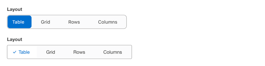
Selected Visual Signifier
The active state should always include the checkmark inside the component to indicate an item is selected. The checkmark should not be visible if the option is not selected.
Do This
Don't Do This
- The active state should never be shown without the checkmark as a signifier
- The checkmark should never be shown if the active state is intended or without the active state background color
Questions?
Connect with the DLS Team on Slack or by email.
Resources
Check out additional resources.