Segmented Control
Segmented control are used to switch between alternative views of similar or related content.
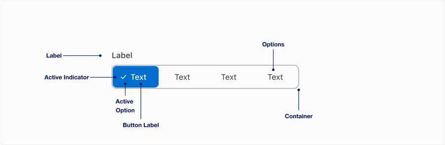
Anatomy
| Name | Description | Required |
|---|---|---|
| Label | Used to inform the user of the types of options within the segmented control. | No |
| Active Indicator | Check icon used to inform the user of which item they have selected within the segmented control. | Yes |
| Active Option | A visual signifier to show the user which segmented control is currently active by the background color. | Yes |
| Container | Segmented control options are held within the container in order to show which words on the page are options within the control. | Yes |
| Options | Two to five unselected options that are held within the container. | Yes |
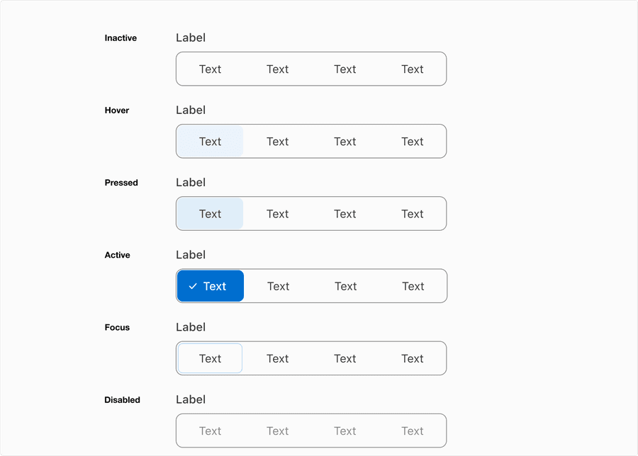
States
| State | Description |
|---|---|
| Inactive | Inactive state allows users to tap or click the button to activate an action. |
| Active | The active state indicates the selected option. |
| Hover | Background color change indicates to a user that the option is clickable. |
| Pressed | Background color change indicates to a user that the button is being selected. |
| Focus | A focus outline appears around visual element to help users identify current selected option. This is used when a user navigates using keyboard controls or uses a cursor. |
| Disabled | The button isn’t interactive and no options are selected. Avoid using disabled, its best not to show it or an informative alternative on why its disabled. If you do choose to use a disable a segmented control, use aria-disabled=true instead of disabled, so it’s announced to screen reader users. |
Questions?
Connect with the DLS Team on Slack or by email.
Resources
Check out additional resources.