Menu
Menu allows a user to view a list of actions and make selections between them. Menus can also include radio buttons and checkboxes.
On this page
Best Practices
- When users need to select from a short list of related actions or settings
- To present options that apply to a specific context (for instance card, row, or item)
- When inline space is limited but the action set still needs to be accessible
- When providing quick access to less prominent actions (such as edit, share, or report)
- If the options do not require extra description or form elements
- When consistency in placement or interaction across surfaces is important
- When the user must choose from a large number of options — use a Select or Search component instead
- To expose high-priority or primary actions; use Buttons or surface actions
- If the menu content needs to persistently stay open while interacting with it — consider a Modal
- When the action labels require more than a single line of text to be clear
- For exposing navigation destinations; use a Tab or a Link List instead
- Hide critical or high priority actions in an overflow menu (they should live in the main menu)
Variations
| Variation | Description | Usage Examples | Actions |
|---|---|---|---|
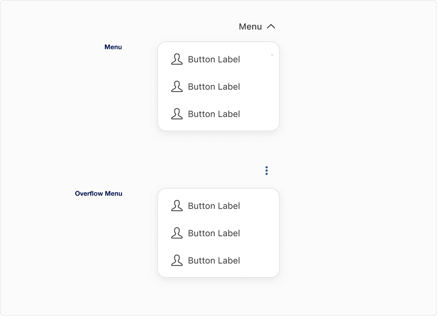
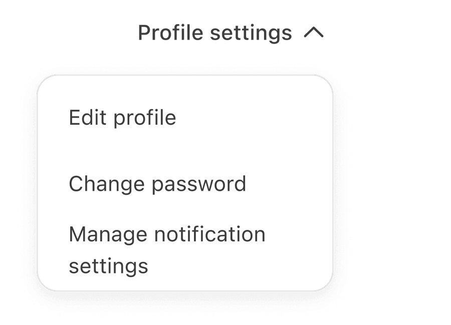
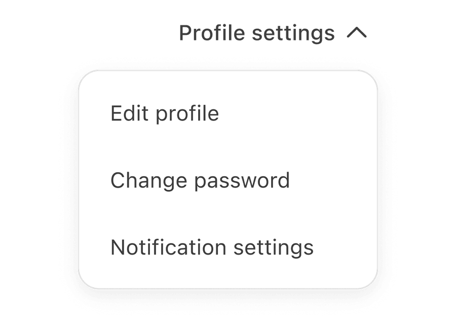
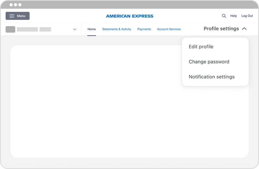
| Menu | Used when a clearly labeled trigger is needed to expose a list of actions or options. Best for primary, high-priority actions with strong, contextual reverence. Avoid pleasing critical actions in overflow. | A profile page’s settings where the menu would expose “Edit Profile,” “Change Password,” and “Notification Preferences” | Primary Actions |
| Overflow Menu | Used when space is limited or for secondary/infrequent actions. Triggered by a Toggle Button Icon, avoid hiding critical actions, overloading with unrelated options, or relying on overflow for discoverability. | Commonly used in toolbars (Download, Report Issue), compact UIs such as Tables, or “Advanced Settings” where actions are occasionally used but not core to everyday tasks | Secondary Actions |
Recommendations
Labels Guidance
Labels name the menu or menu item clearly and concisely, making its purpose instantly recognizable

- Provide clear, specific trigger labels for standard menus to communicate what kind of options will be shown
- Use sentence case for readability, such as “Sort by” or “More options”
- Keep labels concise; one to three words is ideal
- Prefer verbs or concise noun phrases like “Filter” or “Display options”
- Use icon-only triggers, like overflow menu only when the context is obvious or screen readers are properly supported with aria-label
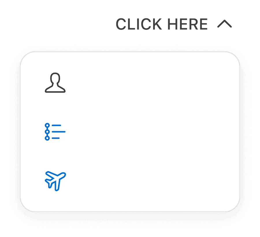
- Use clear, descriptive menu labels. Avoid phrases like “Click here” unless the surrounding layout already makes the links purpose obvious, known as visually scoped.
- Use “Placeholder text” as a Item label or Menu Label - it harms accessibility
- Use ALL CAPS for Menu Labels or Item Labels - it reduces readability, especially for assisted technology
- Use icons alone without alternative text or descriptive labeling; this creates ambiguity and screen reader issues
- Use Item Labels that mislead or do not reflect the options inside (for instance labels that say “Download” but includes “Edit” or “Share”)
What does “visually scoped” mean?
A descriptive phrase that is sometimes used in UX and accessibility writing to convey the idea of context through layout.
When the visual layout of a page makes the meaning of a vague Label or Link obvious.
Why can’t I remove the label?
Removing the label from the Menu or Overflow Menu violates WCAG 1.3.1 - Info and Relationships and WCAG 4.1.2 - Name, Role, Value, resulting in inaccessible experiences for assistive tech users. Never rely on visual design or color alone to convey purpose or progress.
If a label is removed, screen readers announce a progress bar but with no context. They will not know what is progressing: Is it a form, a task?
Layout
Alignment and localization
- Keep menu items left aligned (for LTR layouts) to support fast scanning and screen reader consistency
- Allow menu item labels to wrap within the container rather than adjusting the menu with

- Truncate labels when they exceed the fixed width; allow them to wrap instead
- Center-align menu text; it disrupts left to right scanning and reduces readability
Width and resizing
Keep overall menu width to the system-standard fixed-width of 224 px to ensure visual consistency across the product
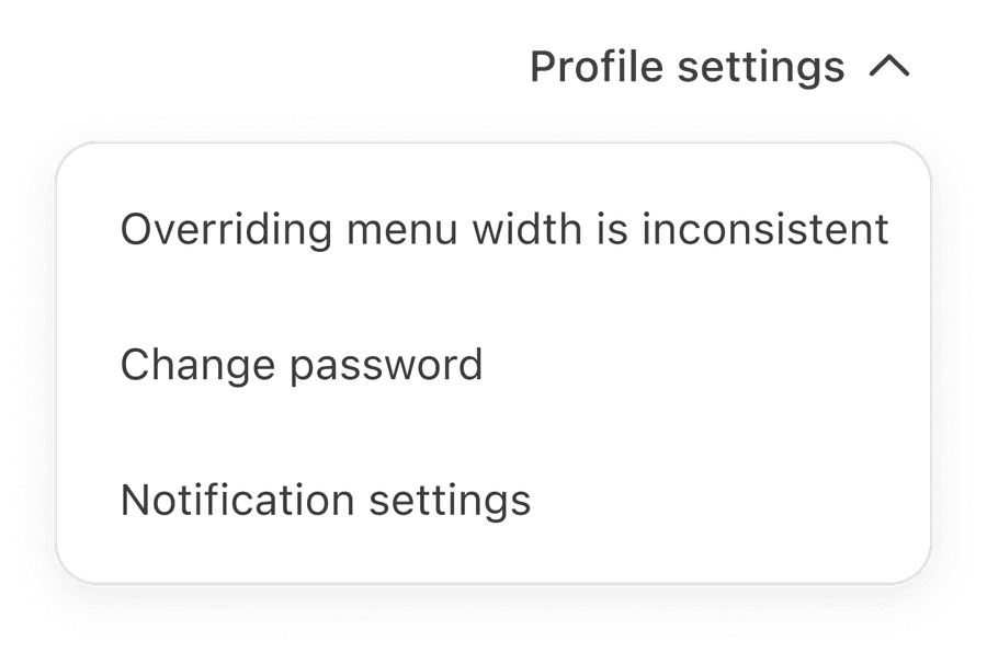
Override the default menu width; resizing the menu to fit longer text break alignment and creates inconsistent layouts
Alignment and positioning within the UI
Align menu triggers with surrounding content or controls to maintain visual rhythm

- Place menus without clear visual anchors (floating randomly with no trigger context)
- Avoid placing far from the content it affects
- Hide critical actions inside an overflow menus if they are used frequently
Icon
Icons require descriptive text labels and consistent placement
- Provide descriptive text labels to clarify the meaning of the action;
- Use standard recognizable icons such as Pencil for edit or Trash for delete
- Align icons to the left of the menu item text for LTR layouts (right for RTL)
- Keep icon size consistent
- Provide aria labels for screen readers within the Button List component
- Use icons without text
- Non-standard or decorative icons that do not add meaning or clarity
- Mix left- and right-aligned icons within the same menu; always maintain consistency and consider localization
- Avoid over-using icons; they should reinforce, not distract
- Use icons that conflict with platform conventions (for example a “plus” icon for delete)
All non-text content (for example the Icon within the Button List) must have a text alternative. Please utilize the Icon Button Tertiary Component Properties to provide Alt Text.
Removing or not providing text alternatives violates WCAG 1.1.1 - Non-text Content, resulting in inaccessible experiences for screen reader users.
If no accessible name is provided, screen readers may ignore the icon entirely as they will not know it exists, the control may be announced generically with no indication of purpose, users may be unable to interact with the date picker or understand how to open it. Provide descriptive text to convey intent.
Questions?
Connect with the DLS Team on Slack or by email.
Resources
Check out additional resources.