Menu
Menu allows a user to view a list of actions and make selections between them. Menus can also include radio buttons and checkboxes.
On this page
Menu
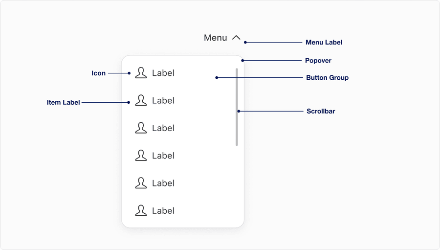
Anatomy
| Name | Description | Required |
|---|---|---|
| Menu Label | A concise descriptive trigger that communicates the scope of the menu; it should reflect the nature of the menu contents | Yes |
| Popover | The visual container or bounding box that holds the menu list content; provides structural layout and elevation | Yes |
| Scrollbar | Appears when menu content exceeds the max height; allows users to scroll through content without layout breakage | No |
| Item Label | Used within each list type, a test label within each item should be clear, concise and follow sentence case | Yes |
| Icon | Graphic element to enhance the visual appeal and tell the user more about buttons action. Can be used before or after the label. Choose the appropriate Icon based on the buttons action. | Optional |
States
| State | Description |
|---|---|
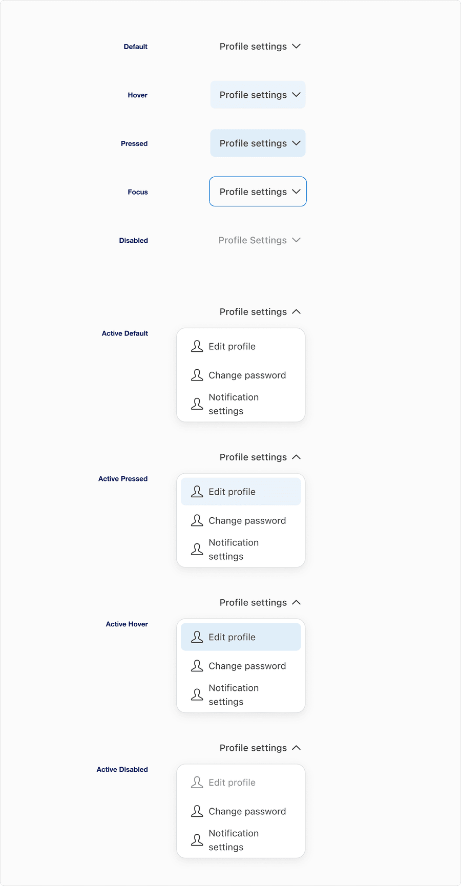
| Default | Represents the initial inactive state before a user interacts with the trigger |
| Hover | Indicates that the users pointer is hovering over the trigger. Shows a subtle background change. |
| Pressed | Reflects the moment the trigger is actively being clicked or tapped. Includes a visual darken color change to indicate engagement. |
| Focus | Occurs when the trigger receives keyboard focus (for instance via Tab). Displays a visible focus ring to support to support accessibility and navigation clarity. |
| Disabled | The trigger is non-interactive. Visually muted and cannot be hovered, focused, or activated. Use sparingly and with supporting context. |
| Active Default | Represents the open menu state where the menu is visible, but no item is being interacted with. The trigger’s caret changes position to upward. |
| Active Hover | A menu item is being hovered while the menu is open. indicates which item will be selected if tapped or clicked. |
| Active Pressed | A menu item is in the pressed state during menu interaction. Appears darker to confirm tactile feedback. |
| Active Disabled | Represents a menu item in the open menu state that is visible but unavailable for interaction due to context or conditions (required selections are not met) |
Overflow Menu
Anatomy

| Name | Description | Required |
|---|---|---|
| Overflow Menu Icon | A concise descriptive trigger that communicates the scope of the menu; it should reflect the nature of the menu contents | Yes |
| Popover | The visual container or bounding box that holds the menu list content; provides structural layout and elevation | Yes |
| Scrollbar | Appears when menu content exceeds the max height; allows users to scroll through content without layout breakage | No |
| Item Label | Used within each list type, a test label within each item should be clear, concise and follow sentence case | Yes |
| Icon | Graphic element to enhance the visual appeal and tell the user more about the action. Choose the appropriate Icon based on the buttons action. | Optional |
States
| State | Description |
|---|---|
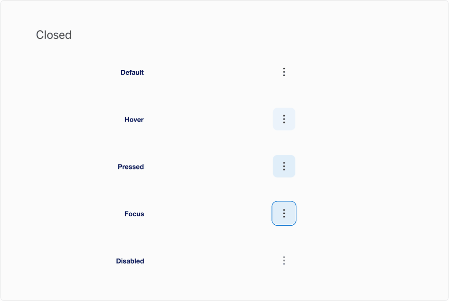
| Default | Represents the initial inactive state before a user interacts with the trigger |
| Hover | Indicates that the users pointer is hovering over the trigger. Shows a subtle background change. |
| Pressed | Reflects the moment the trigger is actively being clicked or tapped. Includes a visual darken color change to indicate engagement. |
| Focus | Occurs when the trigger receives keyboard focus (for instance via Tab). Displays a visible focus ring to support to support accessibility and navigation clarity. |
| Disabled | The trigger is non-interactive. Visually muted and cannot be hovered, focused, or activated. Use sparingly and with supporting context. |

| State | Description |
|---|---|
| Popover Default Item | The trigger is non-interactive. visually muted and cannot be hovered, focused, or activated. Use sparingly and with supporting context. |
| Popover Hover Item | A menu item is being hovered while the menu is open. indicates which item will be selected if tapped or clicked. |
| Popover Pressed Item | Represents the open menu state where the menu is visible, during menu interaction. Appears darker to confirm tactile feedback. |
| Popover Disabled Item | Occurs when the trigger receives keyboard focus (for instance via Tab). Displays a visible focus ring to support to support accessibility and navigation clarity. |
Questions?
Connect with the DLS Team on Slack or by email.
Resources
Check out additional resources.