Icon Button
Icons buttons are subtle triggers for actions. They are visual, clickable elements that represent and provide access to functions, commands, files, devices or directories, as well as common actions.
On this page
Best Practices
- To complete an action for example close a modal or open a menu use icon button
- To activate or deactivate an object or element, for example bookmark/un-bookmark a page use icon toggle button
- Enable users to quickly locate a desired action without having to read text
- Use the recommended colours and weights to retain uniformity
- Use a contrast ratio of 3:1 or more
- Make sure the alt text for the icon is correct for your use case
- If the button navigates you to a new page
- Don’t use icon toggle buttons for complex toggle actions. Use a toggle switch, for example turning on settings.
Recommendations
When to Use Icon Button
Icon buttons enable users to quickly locate a desired action without having to read text.
- Use for common actions such as close. You can find more examples of common actions in our icon library.
- Don’t use for new or complex or critical actions such as submitting a form
- Don’t use icons buttons for complex actions to save space
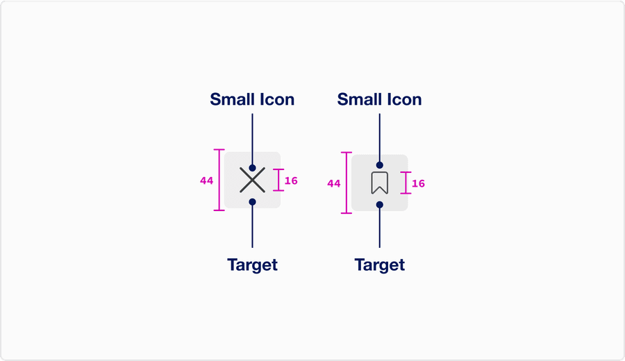
- Make icon buttons smaller, icon button have the minimum 44x44px target size.
When to Use Icon Toggle Button
Icon buttons enable users to quickly locate a desired action without having to read text.
- Use to activate or deactivate an object or element, for example such as bookmark/un-bookmark or show/hide. You can find more examples of common actions in our icon library.
- Don’t use activate or deactivate a new or complex or critical actions such as settings
- Don’t use icons buttons for complex actions to save space
- Make icon buttons smaller, icon button have the minimum 44x44px target size
Choosing Icons
Icons used within icon buttons should be simple, with well known visual metaphors, such as close, cross for plus, a hand with a thumbs-up, pencil for edit, or lock.
- Use simple well known icons for example close and edit
- Take real world examples for example pencil for edit
- Be consistent. Always use the same icon for action.
- Think customer consistency. Follow the icon names available in our icon library for the actions when possible.
- Consider icon meaning and localization
- Use different icons for the same action
- Use the same icon for different actions
- Use complex icons
- Icons need to be simple and easy to understand.
- For accessibility, we need to make sure we use icons for the same meaning throughout our website. Consistent identification accessibility standards
- Remember: the more complex the icon, the longer a user spends understanding them.
Disabled Buttons
Try to avoid using disabled buttons when possible, opting for enabled buttons or no button and an informative alternative, such as ‘out of stock’.
If you do choose to use a disable a button, our buttons use aria-disabled=true instead of disabled, so it’s announced to screen reader users.
- Avoid disabled icon buttons when possible
- Instead of a icon button try using an informative plain text alternative, like “out of stock”
- Use form validation
- Always provide a way out
- Use a disabled button to prevent information from being submitted twice e.g. double bookings
- Use
aria-disabled=true
- Don’t use disabled icon button to communicate information.
- Disable the form submit until the form is complete.
Disabledbuttons are visible, but not always focusable. They are not announced to screen readers using tab, and can only be found if your users go looking for them.- Disabling submit buttons in forms stops users from seeing error messages. Error messages save users time by helping users know where they have incorrectly filled in a form.
Backgrounds
Buttons can go on different colored backgrounds, aim for a 3:1 contrast with button focus and their surrounding colors. More on color contrast.
- Use icon button on white, gray 100, gray 200.
- Use icon buttons on dark backgrounds
- Use buttons on backgrounds when their background to button focus contrast is lower than 3:1
Icon and Icon Button Size
Icons buttons use small sized icons. Find out more about icon sizes in our icon library.
Questions?
Connect with the DLS Team on Slack or by email.
Resources
Check out additional resources.