Icon Button
Icons buttons are subtle triggers for actions. They are visual, clickable elements that represent and provide access to functions, commands, files, devices or directories, as well as common actions.
On this page
Icon Button
Anatomy
| State | Description | Required |
|---|---|---|
| Background | Background color conveys states hover or pressed. | Yes |
| Icon | Graphic element to enhance the visual appeal and tell the user more about buttons action. Choose the appropriate Icon based on the buttons action. See choosing icons | Yes |
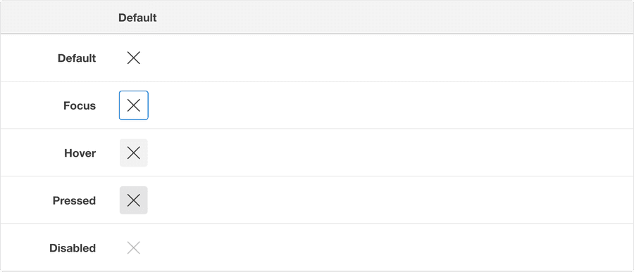
States
| State | Description |
|---|---|
| Default | Users can select the button to activate an action. |
| Hover | When a cursor hovers over the button, the background color changes to indicate that the button is clickable. |
| Pressed | Background color change indicates to a user that the button is active. |
| Disabled | Avoid disabled buttons when possible. The disabled state is for if you are still showing the button, but the actions it completes are disabled. The background and text color changes to indicate to a user that the button is inactive. Read more about disabled buttons. |
| Pressed | A focus outline appears around visual element to help users identify current selected component. This is used when a user navigates using keyboard controls or uses a cursor. |
Icon Toggle Button
Anatomy
| State | Description | Required |
|---|---|---|
| Background | Background color conveys states hover or pressed. | Yes |
| Icon | Icon fills when toggle button is on. Graphic element to enhance the visual appeal and tell the user more about buttons action. Choose the appropriate Icon based on the buttons action. See choosing icons | Yes |
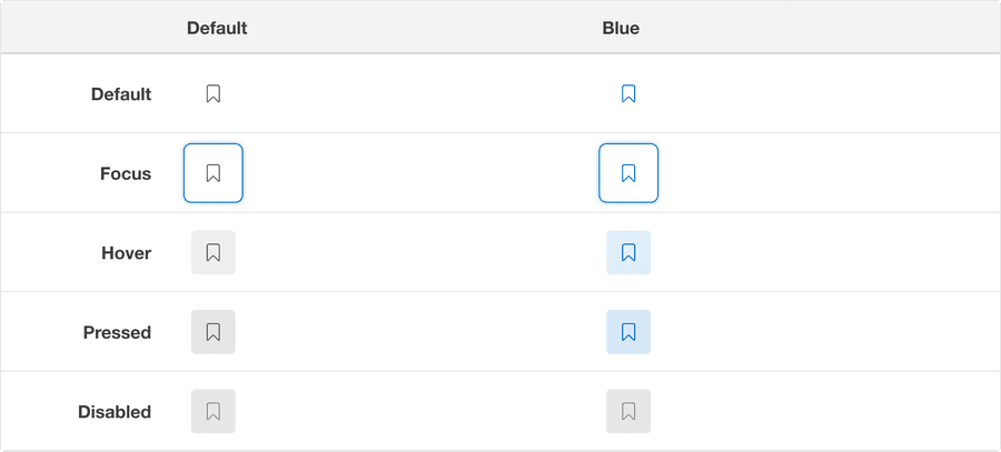
States
| State | Description |
|---|---|
| Default | Users can select the button to toggle on an action, for example bookmark. |
| Hover | When a cursor hovers over the button, the background color changes to indicate that the button is clickable. |
| Pressed | Background color change indicates to a user that the button is active. |
| Disabled | AAvoid disabled buttons when possible. The disabled state is for if you are still showing the button, but the actions it completes are disabled. The background and text color changes to indicate to a user that the button is inactive. Read more about disabled buttons. |
| Pressed | A focus outline appears around visual element to help users identify current selected component. This is used when a user navigates using keyboard controls or uses a cursor. |
Questions?
Connect with the DLS Team on Slack or by email.
Resources
Check out additional resources.