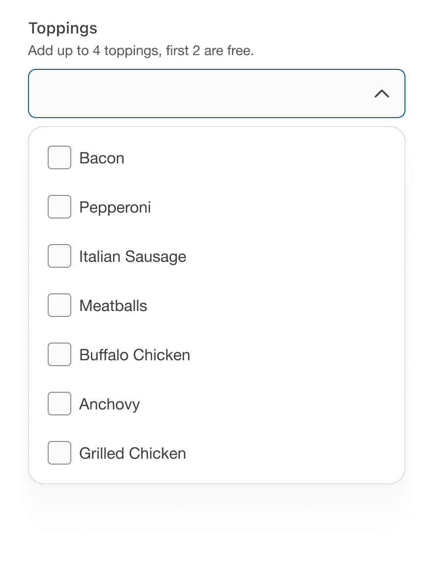
Multiple Select
Multiple select allows users to make a multiple selection from a dropdown list of five or more items. For fewer than five items consider using checkboxes.
On this page
Best Practices
- To let a user choose more than one option from a dropdown list
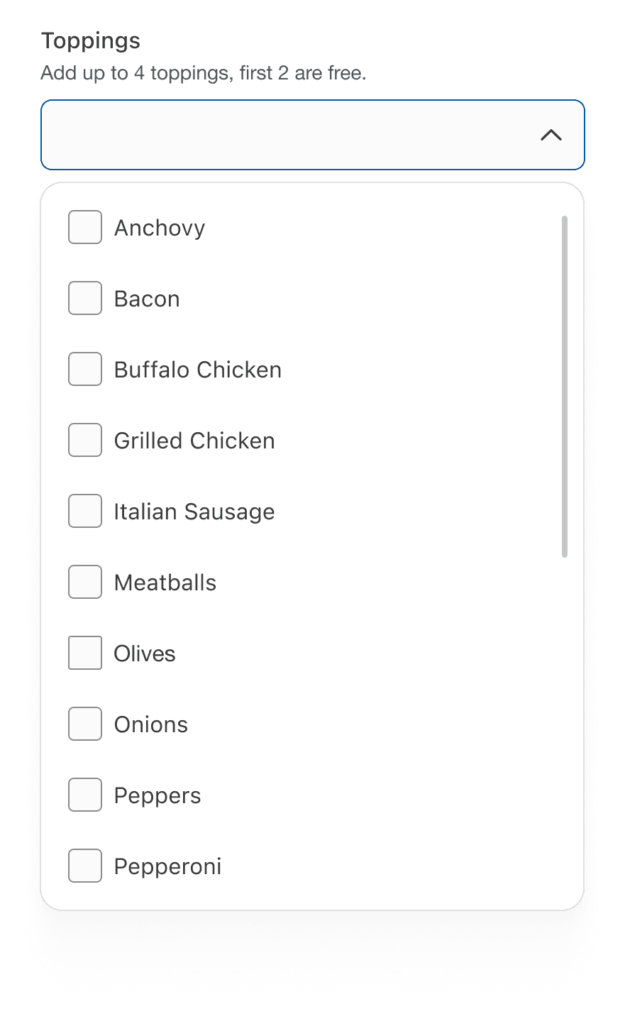
- When you have six or options to choose from
- If you would like to save vertical space
- If the list is populated from a data source and unaware of how many options there will be
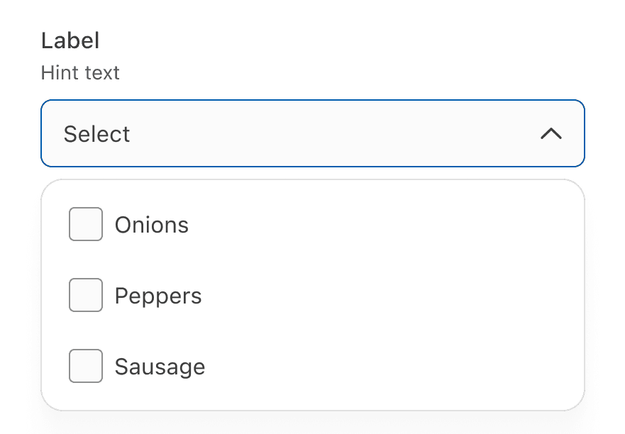
- With optional hint text to provide additional instructions
- To reduce vertical space
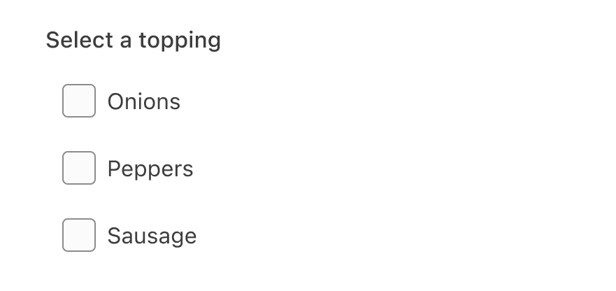
- If there are five or less options, consider checkbox for multi selection
Variations
| Variation | Description |
|---|---|
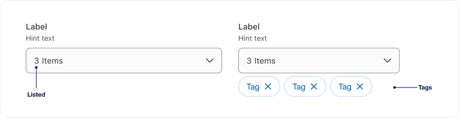
| Listed | Number of selected items are filled in input field. |
| Tags | Optional dismissible tags can be used outside of dropdown, providing visibility and quick action to dismiss a selection. Best used for filters. |
Recommendations
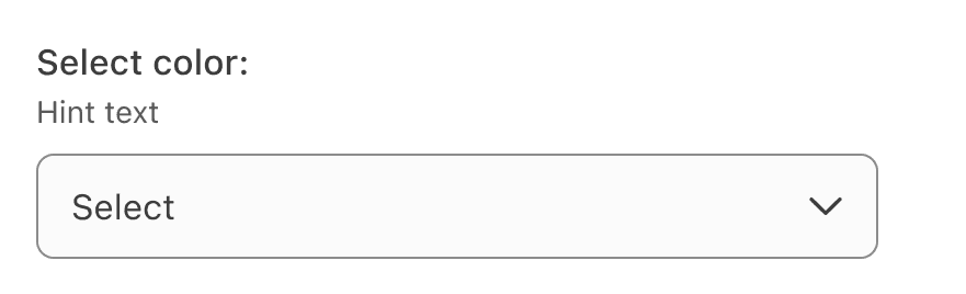
Select labels are required and should be short, clear and descriptive. It should be easy for the users to understand what they are selecting.

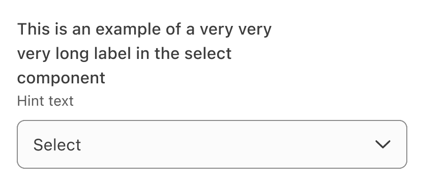
When writing labels, use sentence case, not title case or all caps (unless using a proper noun).


Avoid ending labels in colons or commas.

List the options in alphabetical order or any other order which makes sense.
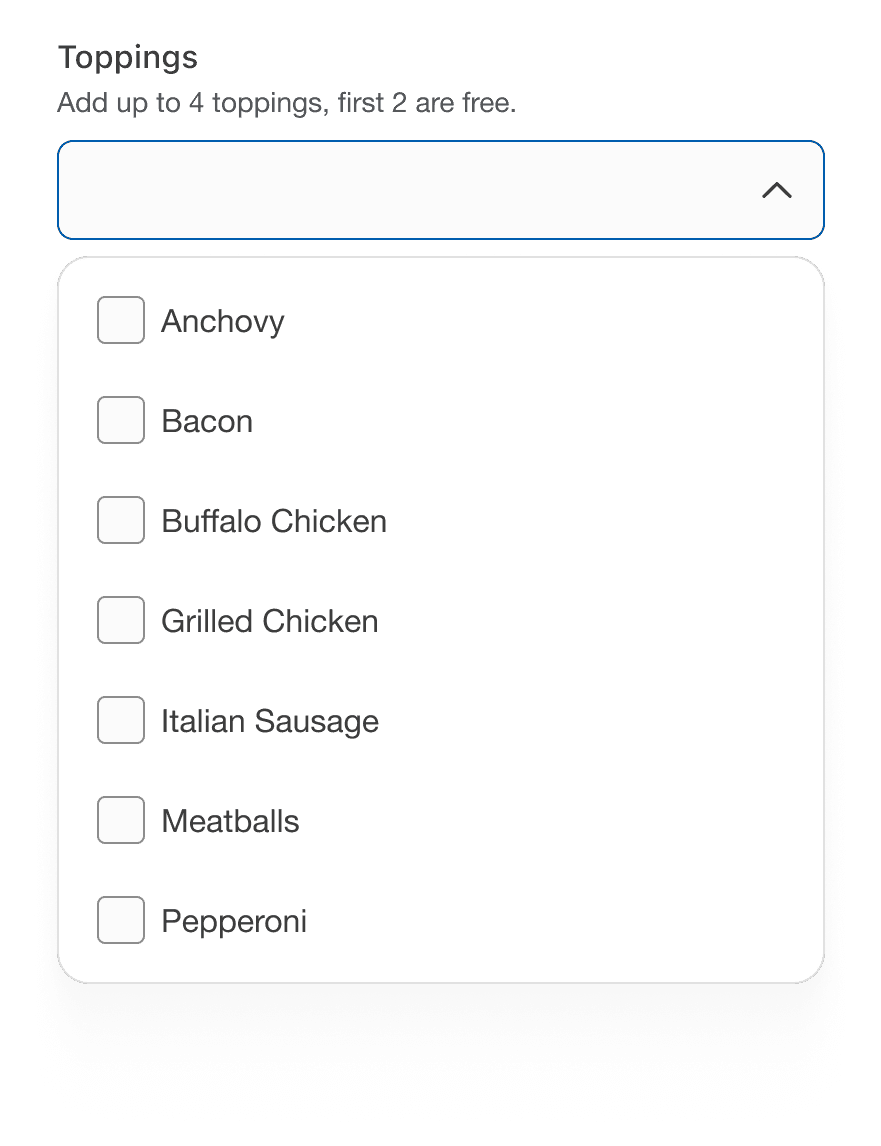
Avoid long dropdowns that require scrolling because they make it difficult to view all items immediately. If you have too many items to include, consider using an autocomplete field that customers can type in to filter results, such as search input with typeahead.

If there are five or less options, consider using checkbox for multi selection.
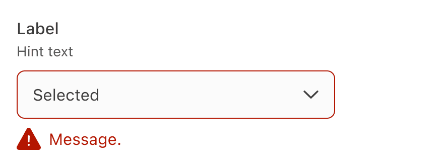
Avoid adding error within the dropdown, display it below the input field.

Behavior
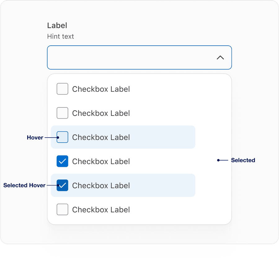
- On hover we have introduced a blue, so a user can identify easily between hover and selected. With elements right next to each other the focus ring will be inside 4px of the visual element.
- Selected item will have check icon and gray background filled in to let user know that selection is selected.
- Selected hover highlights in blue similar to hover with the addition of check icon within checkbox.
Questions?
Connect with the DLS Team on Slack or by email.
Resources
Check out additional resources.