Search
A search field is a text input enhanced for finding results. It can be used alone or with a typeahead menu of list items.
Anatomy
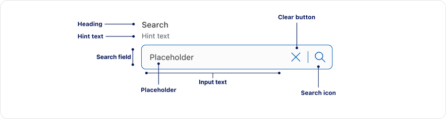
| Name | Description | Required |
|---|---|---|
| Heading | A concise label that identifies the purpose of the search field. | Optional |
| Hint Text | A short text that provides a hint or example for users. | Optional |
| Search Field | The overall container that includes the input text, close icon and search icon. | Yes |
| Input Text | The area where users type their query. | Yes |
| Placeholder | A temporary hint or example of what users can search for before users enter any input. | Yes |
| Search Icon | Search Icon | Yes |
| Clear Button | Allows users to dismiss the characters in the search field | Yes |
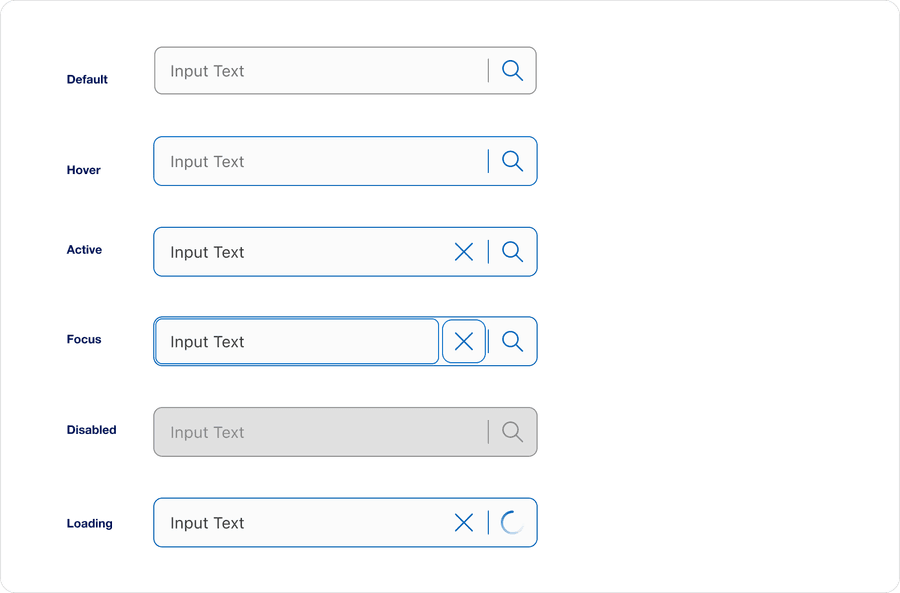
States
| State | Description |
|---|---|
| Default | When the search field is empty and ready for user input. |
| Hover | When a user’s cursor is over the search’s field. |
| Active | A focus outline appears around the search’s field to help users identify current selected component. This is used when a user navigates using keyboard controls or uses a cursor. |
| Focus | When a user clicks into the search field or navigates using the keyboard. |
| Disabled | When the search field is non-interactive and inactive icons. |
| Loading | A spinner indicates the query is processing. |
Questions?
Connect with the DLS Team on Slack or by email.
Resources
Check out additional resources.