Notification
Notification are a type of alert. Notifications succinctly message relevant information. They’re timely, easy to understand, and have a clear purpose. Be straightforward in tone and action to help guide people through.
Best Practices
- Either permanent or dismissible
- With the most appropriate variation of notification
- To provide important information to the user without impeding their workflow
- For important status changes
- To show task generated notification. For example, form validation or success message
- To show a system generated notification. For example, system maintenance or loss of network connection
- Page level notifications if you need the user to take immediate action
- Page level notifications for components
- Component level notifications for pages
- With animations
- Page level notifications with a time out
- For marketing promo or information
Variations
Page Level Notifications

| Variation | Description |
|---|---|
| Information | Use for messages that are both helpful and related to content on the screen |
| Success | Use for the successful completion of an action and include next steps when helpful. These should not be used as toasts. |
| Caution | Use for messages that require attention but are not a critical blocker to moving forward or security |
| Error | Use for negative messages that need immediate attention and a resolution. Reserve for errors or an impact to security. When the message tone is severe and requires a fix, it shouldn’t be dismissible. |
Component Level Notifications

| Variation | Description |
|---|---|
| Success | Use for the successful completion of an action and include next steps when helpful. |
| Error | Use for negative messages that need immediate attention and a resolution. Reserve for errors or an impact to security. |
Recommendations
Writing Notification Messages
It’s important to think about what the user needs in the moment. Offer solutions to address issues and get ahead of their problems or questions.
Write in an 8th grade (13-14yr old) reading level. This considers people with disabilities and users reading in a second language.
Page Level Notifications:
Notification messages may use both title and message or one of title or message.
- Use the most appropriate variation of notification
- Get straight to the point with the most important information
- Tell the user what they need to know
- Make the user feels supported
- Make it easy for the user to understand their next action
- Own up to our mistakes and be proactive in fixing them
- Use interface agnostic language, like ‘select’ instead of ‘click’
- Avoid directional language or visuals, such as ‘select the red button below’ and try ‘select the submit button’ instead
- Use page level notifications to provide a error summary in forms, along with component notifications
- End messages with a period
- Waste time by being verbose
- Make the user guess what the error is
- Hide key information in long paragraphs
- Use curt, threatening or accusatory language
- Make generalisations
- Refer to ourselves as American Express - instead use “we” or “us” for a more conversational tone
Component Level Notifications:
Component notification must have a message, this is best practice and also an accessibility requirement for errors. Find out more about accessibility requirements for messages.
- Error messages in form validation
- Use success or error styles when appropriate
- Get straight to the point with the most important information
- Tell the user what they need to know
- Make the user feel supported
- Make it easy for the user to understand their next action
- Own up to our mistakes and be proactive in fixing them
- Use status caution orange on text. Caution is only suitable for Icons.
- Waste time by being verbose
- Make the user guess what the error is
- Use difficult or confusing phrases, like “suspension timeframe”
- Offensive messages, like “invalid” for a name
Writing Error Messages
When defining error scenarios and writing their messages consider:
The Problem
What happened and why?
The Solution
What can the user do to fix the problem? If there isn’t anything they can do, what’s the most helpful thing we can tell them?
- Use succinct and conversational complete sentences
- Don’t over-explain technical issues
- Avoid apologizing
- Focus on guiding the user by explaining the problem and what action they can take to fix it
“We were unable to load your information. Please try reloading the page.”
“Sorry! This API failed to pull data from our system. Your action could not be completed.”
No one knows what that means or what they should do next.
Although the best error message is no error message, it’s inevitable that things will go wrong, either due to the user inputting something incorrectly or a system failure. When this happens, it’s important to get the error message right. Before writing the error message, clearly identify the problem and the solution.
Error messages save users time by helping users know where they have incorrectly filled in a form.
Placement
Page Level Notifications:
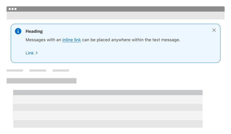
Notifications prominently appear directly below the navigation and above all other components displayed on the page.
Notifications take up space on the screen and push page content down. When dismissed the space they leave should be filled.
Notifications take up space on the screen and push page content down.
- Don’t put notification over content
- Don’t make notifications sticky

Notifications that cover content may cover critical information for the user such as page title, navigation, statuses, and content related to the notification. When designing any sticky elements, remember to consider reflow and screen height. Larger notifications could cover the whole page.
Component Level Notifications:
Appear below inputs so they are predictable. However, there are some exceptions, like date picker. When placing notification inside the date pickers calendar put them above the calendar. Find out more about notification placement for date picker.
Component level notifications appear below inputs so they are predictable.

Change the order of content in a component, forms should be predictable though out our users experience.

Dismissing Page Level Notifications
Dismissing a notification is optional and should match the type and tone of the message. Always consider the best user experience when choosing between a permanent or temporary notification.
When dismissing, do not add animations that distract or redraw content on the page.
Notifications can be dismissible or permanent.
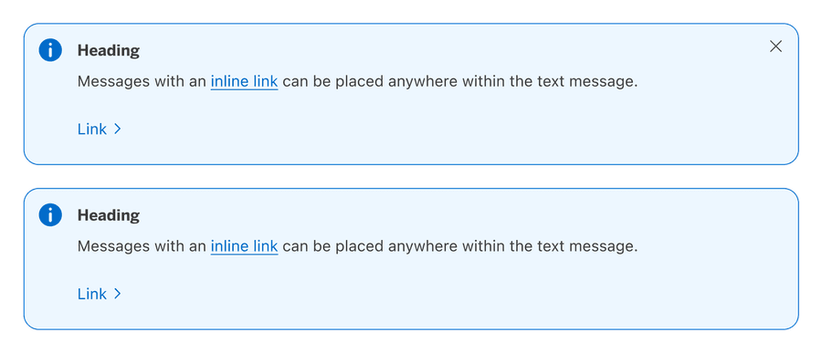
Mixing Styles
To help people focus on the message, strive to only have one notification shown at a time. If it’s impossible to avoid and multiple notifications need to be shown, keep their style consistent.
- Avoid stacking notification when possible
- Keep permanent notifications on top
- Use the same heading and body layout
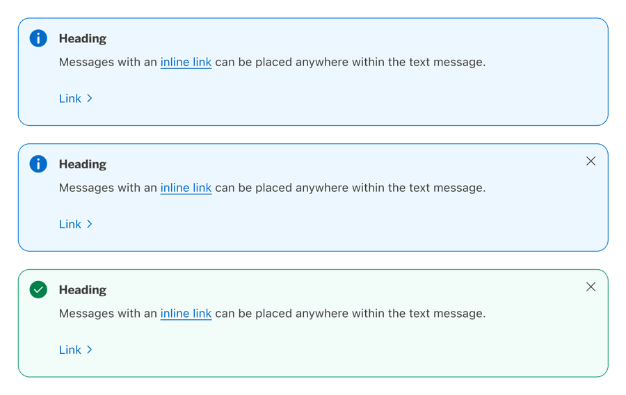
- Don’t put permanent after dismissible notifications
- Don’t mix notifications with and without headings
- Avoid stacking notification when possible
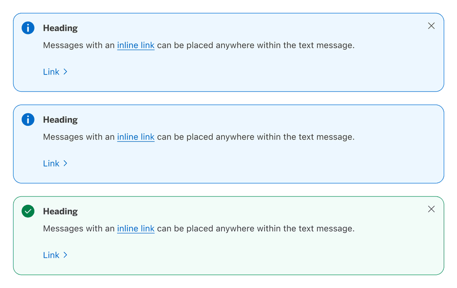
Multiple messages take longer to understand when they have inconsistent styles.
Responsive
Page Level Notification

To optimize fit across a wide range of screen sizes, horizontal padding is responsive and matches the gutter sizing of our grid breakpoints.
Component Level Notification

For smaller breakpoints and longer error messages text wraps, keeping the icon at the top.
Questions?
Connect with the DLS Team on Slack or by email.
Resources
Check out additional resources.