Loaders
Loaders provide system feedback about the duration and progression of a system status, such as a download, file transfer, or installation to indicate how long a user will be waiting. They are used to reassure the user that the system is working and communicates actively while waiting for a response to change.
Linear Determinate
Anatomy
| Name | Description | Required |
|---|---|---|
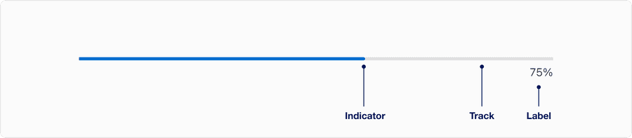
| Indicator | Represents current completion status as a percentage. It can be partially filled or complete. | Yes |
| Label | A text label showing the numeric percentage, communicating exact progress. | Yes |
| Track | Represents the total scope of the task. | Yes |
Linear Indeterminate
Anatomy

| Name | Description | Required |
|---|---|---|
| Indicator | The moving segment that loops within the track to suggest ongoing activity. This repeats in a loop as an infinite animation. | Yes |
Progress Circular Indeterminate
Anatomy

| Name | Description | Required |
|---|---|---|
| Spinner Arc | The animated, partial arc that rotates 360 degrees. Visually communicates ongoing system activity or loading. | Yes |
Size

| Size | When | Examples |
|---|---|---|
| Small | In compact layouts, when space is limited or dense UIs | Inside a button or toggle, embedded in a table cell, or as part of a small card or compact widget |
| Medium | Used for most general-purpose loading needs | Centered on page or container while loading content, inline with modals, drawers or full-screen overlays |
| Large | When loading is the primary focus or requires strong user attention | Full-page loading states, clocking actions that prevent further interaction, paired with branding or messaging |
Questions?
Connect with the DLS Team on Slack or by email.
Resources
Check out additional resources.