Split Button
Split button allows users to have a primary action along with the option to choose from a list of nested related secondary actions.
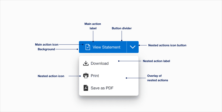
Anatomy
| State | Description | Required |
|---|---|---|
| Main action label | Used to inform the user of the expected button action. | Yes |
| Nested actions icon button | Separate button that reveals the nested actions overlay when pressed | Yes |
| Overlay of nested actions | List of nested actions. The list is open after the more actions icon button is selected and will closed after a nested action is selected or user selects a component outside the overlay. | Yes |
| Background | Background color can convey active, hover, pressed or disabled. | Yes |
| Nested action label | Used to inform the user of the expected button action. | Yes |
| Button divider | The divider is a visual signifier that separates the primary action button and more actions icon button. It also helps differentiate split button from our select component. | Yes |
| Main action icon | Graphic element to enhance the visual appeal and tell the user more about buttons action. Buttons should either all have icons or all have no icons. Choose the appropriate Icon based on the buttons action. Icons are for use with a label. See choosing icons | Optional |
| Nested action icon | Graphic element to enhance the visual appeal and tell the user more about buttons action. Choose the appropriate Icon based on the buttons action. Icons are for use with a label. See choosing icons | Optional |
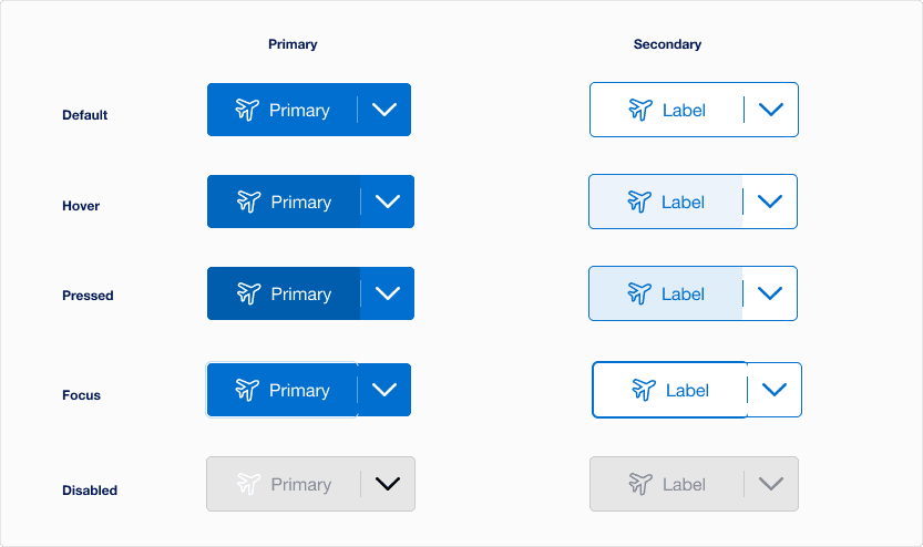
States
| State | Description |
|---|---|
| Default | Users can select the button to activate an action. |
| Hover | When a cursor hovers over the split button, the background color changes indicates to a user that the button is clickable. |
| Pressed | The pressed state activates when either the primary action button is pressed, or the chevron down icon is selected to show the nested dropdown. Background and text color changes indicates to a user that the button is active. |
| Focus | A focus outline appears inside the visual element to help users identify current selected component. This is used when a user navigates using keyboard controls or uses a cursor. |
| Disabled | Avoid disabled buttons when possible. The disabled state is for if you are still showing the button, but the actions it completes are disabled. The background and text color changes to indicate to a user that the button is inactive. Read more about disabled buttons. |
Questions?
Connect with the DLS Team on Slack or by email.
Resources
Check out additional resources.