Increasing Target Size
Harshal Shah
Ever had to tap on an icon multiple times for it to work? The problem may be that the target size is too small. Here at American Express, we are committed to providing inclusive, digitally-accessible experiences to all customers and non-customers. Large target size accommodates everybody, including people with impairments and people on touch devices. As the Design Language Systems (DLS) team in American Express, we follow our new company standards of AAA requirement. One of which is to increase any interactive component to meet a success criteria for a target of 44 x 44px, as a minimum. Let us dive in to see how we have improved the user experience, making it more accessible to our customers.
Success Criteria 2.5.5
Web Content Accessibility Guidelines (WCAG) 2.1 require a success criterion states the size of the target for pointer inputs must be at least 44 x 44px except when:
- Equivalent: If the target is available more than once on a screen that performs the same action, only one of the targets needs to meet the target size 44 x 44px.
- Inline: If the target is in a sentence or block of text, e.g., tool tip or links. Otherwise, the target could overlap with a block of text.
NOTE: If the target is the full sentence and the sentence is not in a block of text, then the target needs to be at least 44 x 44px.
NOTE: A footnote or an icon within or at the end of a sentence is considered to be part of a sentence and therefore are excluded from the minimum target size.
-
User Agent Control: If the size of the target is not modified by the author through CSS or other size properties, then the target does not need to meet the target size of 44 x 44px.
-
Essential: If the target is required to be a particular target size and cannot be provided in another way, while changing it would essentially change the information or functionality of the content, then the target does not need to meet the target size of 44 x 44px.
We have provided the link if you would like to learn more about the success criterium of 2.5.5 understanding the target size.
Updated Components
While going through our accessibility remediation, our aim was to make minimal changes to our components and our design kit ensuring it lessened our impact on our users. Below are a few examples of components that show how we have increased the target minimally.
| Description | Image |
|---|---|
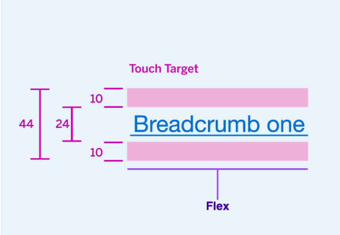
| Breadcrumbs: Component size is 22px, by adding 11px padding to top and bottom, it increased the target to 44px height. |  |
| Small Buttons: Component size remains the same 40px but adding 2px padding on top and bottom increased target to 44px height. |  |
| Floating Button: Increased size from 40px to 44px. The icon remains the same. |  |
| Carousel Controls: Left and right chevrons are a target of 44px x 44px. The dots are no longer interactive, and the currently active dot is slightly larger and white to show the user where they are within the carousel. A play/pause button was added to increase the accessibility of the carousel component. |  |
| Checkbox and Radio: Component remains size 22px and added 11px padding increases the target to 44px. Note that checkbox is reused in data tables and multi-select dropdown. |  |
| Date Picker: Each interactive element increased size to 44px x 44px., keeping mobile screens in mind. |  |
| Text Links: Stand-alone links increase target to 44px height but no changes to inline links. |  |
| Map, Modal, and Notification: Close icon button increased size to 44px x 44px and icon remains same size. |  |
| Pagination: Each interactive element increased target to 44px x 44px. |  |
Are There Any Visual Changes Due to an Increase in Target?
The short answer is, not really. Most of the updated components did not receive any visual changes or updates to their artboards within the DLS design library sketch kit. However, in code we added padding for the target to increase it to 44px x 44px minimum. There were some components that we did need to update visually to the height to 44px to meet success criteria for its target e.g., carousel controls or floating button but it was minor.
Note that all of these will be in the Amex DLS sketch kit for you to explore and link with your current/future designs.
For more information on updating your sketch file with the latest design kit or any accessibility related questions visit our FAQ page.
What is Next?
In the next major version of the DLS, both design and code will see target size improvements. Additionally, we will continue to provide more documentation assisting in the explanation of decisions made during the DLS accessibility remediation.
Feedback or Conclusion
We want to hear from you! Do you have questions about target size and its impact on your team’s work? Let us know on Slack or by emailing dls@aexp.com.
Questions?
Connect with the DLS Team on Slack or by email.
Resources
Check out additional resources.
