


Call to Actions in V7
Senior Product Designer
What are CTA’s?
To understand why we added CTA links to DS v7, let’s first talk about what a CTA is. A call to action (CTA) is a phrase that encourages the user to take a specific action, such as signing up, buying, or downloading something. The goal of a CTA is to persuade the user to move further along in the customer journey, from awareness to conversion. A CTA can be presented as a button, a link, or a line of text that stands out from the rest of the content. Here’s how we define them in the design system:
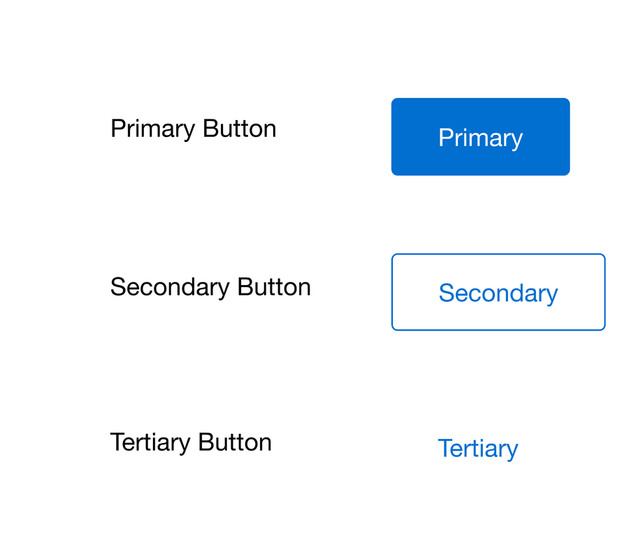
What is a button?
‘A button is a widget that enables users to trigger an action or event, such as submitting a form, opening a dialog, cancelling an action, or performing a delete operation.’ - Button | APG | WAI | W3C
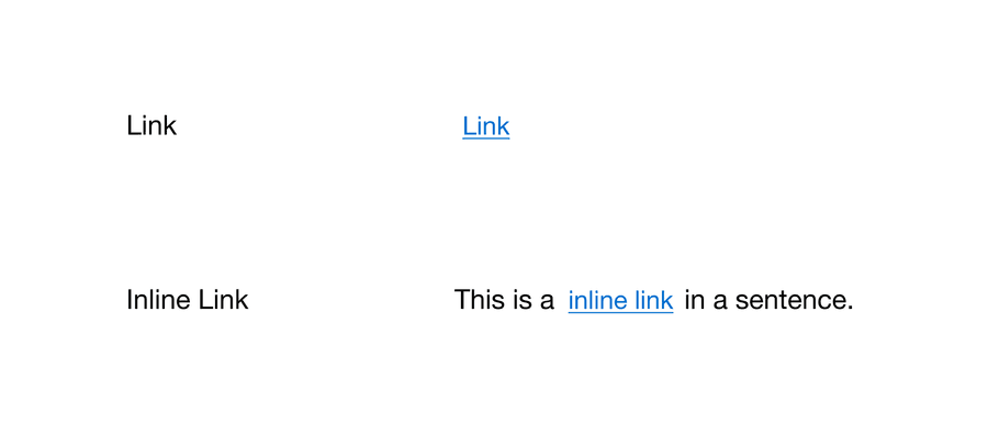
What is a Link?
‘Hyperlinks allow us to link documents to other documents or resources, link to specific parts of documents, or make apps available at a web address.’ - Creating hyperlinks - Learn web development | MDN (mozilla.org)
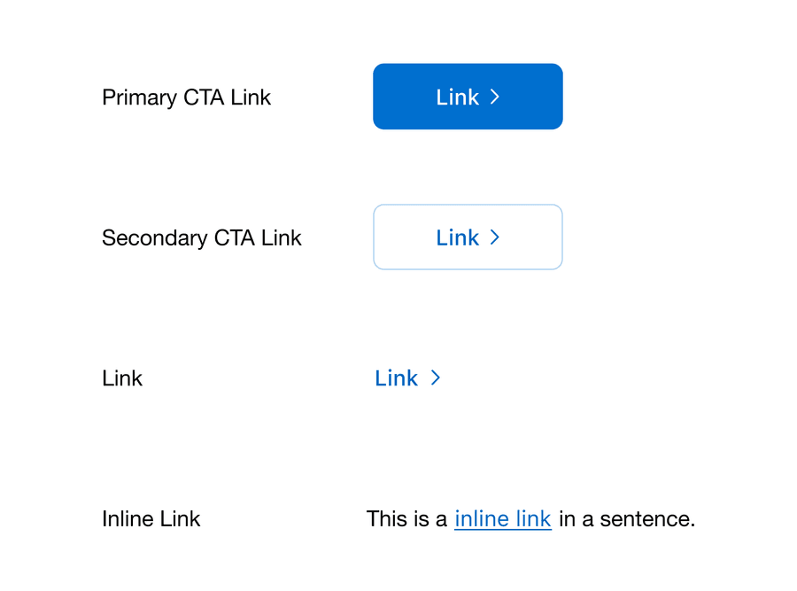
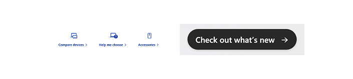
Here are some examples of CTA links and CTA buttons:
| Type | Appearance | Function |
|---|---|---|
| CTA link | Learn about design systems | Takes the user to a different page with more information on design systems. |
| CTA button | Join mailing list | Opens a modal sign-up form on the same page. |
| CTA link | Forgot Password? | Takes the user to a password reset page. |
| CTA button | Log in | Submits the user’s credentials and logs them in. |
Tip: Check-in with your engineer/designer often to check if you will need a Link or Button CTA.
Why did we add CTA links?
As the design system team worked through the accessibility remediation (v6.23), we found a gap in our system. We were missing something that allowed CTAs to be semantically a link and have more visual weight than our regular links.
The use case being: CTA journeys that direct a user to another page or website where they can complete the desired action. Often used for marketing purposes, such as increasing conversions, leads, or sales.
| v6 Links | v7 Links |
|---|---|
|
|
| v6 Buttons | v7 Buttons |
|---|---|
|
|
When should I use a CTA link?
To help you update your designs we have created a flow diagram for choosing components.
- When to use a CTA link - diagram
What influenced the design of CTA links?
When looking for inspiration for the design of the new CTA links, we focused on design systems that were accessible. This included government design systems which by law must work for everybody, along with well-known tech companies such as Apple or Microsoft. We also wanted to make sure that CTA links felt like a link and fit in with our link family that existed in the system already. Here are some examples of links that we found in the wild that influenced our design:
Apple

Microsoft
Australia’s government design system

UK’s government design system

CTA best practice
Keep CTA links clear, concise, and relevant. Clear CTAs guide users seamlessly to their next steps, ensuring an intuitive and satisfying user experience. Concise CTAs avoid unnecessary verbiage, making the message easily digestible and actionable, while relevance ensures that users find the CTA meaningful and aligned with their intentions. Reach out to your UX Writer or content expert for feedback.
At American Express we follow the WCAG AAA Link Purpose (Link Only) (w3.org). To summarize, we should give descriptive link names so the purpose of each link can be identified from link text alone and don’t rely on context.
Here are some examples of good and bad CTA’s
| Bad | Good | Why? |
|---|---|---|
| Click here | Learn about design systems | From the text alone you don’t know where this link with take you. |
| Learn more | Learn about links | From the link text along you don’t know What will you learn more about and where will this link take you. |
| Link | Design System | From the text alone you don’t know where this link with take you. |
How are CTA Links doing?
Let’s take a look at our Figma analytics since adding CTA links to the system when we launched in September 2024. We have found:
- Our design teams have used 1,626 instances of the primary CTA link and 6,383 instances of the secondary CTA link. Total instances are the number of time a component is used within American Express Figma enterprise space that are not detached or inserted and later removed.
- Out of 89 Figma components, secondary CTA link is the 10th top used component in the system, primary CTA is 29th.
- Secondary CTA link is used more than components such as card (13th), icon button secondary (20th), and checkbox (27th).
- We still have a higher usage of buttons with secondary button being 2nd, primary button being 3rd, and tertiary button 8th.
- Also note link is the 5th top used component in the system and inline link is 14th.
From looking at these early numbers, we think that CTA links have very much proved their place in the system.
Summary
I hope this blog post helps you understand why we introduced the CTA link, and help you understand the impact they have on the accessibility of our designs.
Your feedback is invaluable! Whether you’re excited about these developments or have questions regarding their impact on your team’s work, please reach out to us on Slack or via email at dls@aexp.com.
Questions?
Connect with the DLS Team on Slack or by email.
Resources
Check out additional resources.