Footnotes That Everyone Can Follow - Enhancing Accessibility in Your Content
Lauren Simons
Learn how to create Web Content Accessibility Guidelines (WCAG) compliant footnotes that improve user experience, enhance legal copy transparency, and foster trust and customer satisfaction.
What are Footnotes?
Footnotes are auxiliary content placed at the bottom of a page and connected to main content through signifiers (numbers or symbols)1. They provide additional information that might disrupt the flow of main text, such as legal disclosures or citations. Footnotes are used in various formats, including web, mobile experiences, and printed materials like books, reference papers, and direct mail.
Why are Footnotes Important?
Footnote content is critical to users’ overall understanding. An American Express card commercial usability study (2020) with 13 participants found that many users are heavy information gatherers who actively seek out and read the fine print. Contrary to common UX notions that users avoid lengthy text, participants wanted to ensure they were fully informed before making significant financial decisions.
With this in mind, American Express explored ways to improve the current footnote experience.
Footnotes at American Express


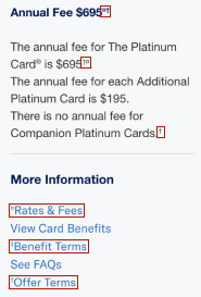
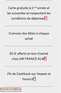
American Express often uses superscripted symbols like daggers and asterisks (†, ‡, *) to reference footnote content, but these symbols come with challenges. The company aims to standardize how footnotes are addressed for better accessibility.
Footnotes in Banking Industry
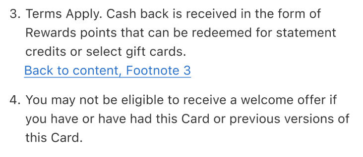
Other companies’ journeys take different approaches. Some use numbered superscripts that link to a static footnote with a ”← back to content” link with the arrow typographical symbol. Others use numbered superscripts and no linking capability. Others use daggers, as we do at Amex. Some conditionally render “return to content, Footnote #” links that display after a superscript has been clicked.
Competitor implementation varies, but reflects efforts to improve navigation and accessibility, at least in the US.
Footnotes in Publishing Industry

Printed materials in the US, such as books and periodicals, often follow Chicago or APA style, both of which use numbered footnotes2,3. This aligns with the mental model of many users educated in the US and should be considered in digital implementations.
What are the accessibility guidelines for footnotes?
The use of daggers and asterisks leads to difficult navigation for everyone, but especially for people who use screen readers. Our new solution considers several critical accessibility success criteria from WCAG. WCAG has 3 conformance levels (A, AA, and AAA), with level A representing the minimum accessibility required for basic site functionality and is what this solution will address.
1.1 Text Alternatives (Level A)
- “Provide text alternatives for any non-text elements so that they can be changed into other forms for all users. These forms include large print, braille, speech, symbols, or simpler language.”4. For the symbols used in footnote superscripts, this means there are text alternatives so that screen reader users understand them.
- Symbols like daggers and asterisks are not images, but typographical symbols. Typographical symbols are built into the font similar to punctuation. Daggers and asterisks lead to inconsistent experiences across different screen readers, some of which skip them entirely5. This is why it is not accessible to use asterisks to indicate required inputs5.
- †, ‡, * specifically, are not read on at least one type of screen reader (JAWS, NVDA, VoiceOver)5.
- An Amex usability study among blind participants (2023 consumer shop, 9 participants) found that some users have no idea what the current daggers symbols mean and may ignore the footnote. This is contrary to what legal intends and may pose a risk to the company.
1.3.1 Information and Relationships (Level A)
- “Relationships among content implied by formatting must be preserved when the presentation format changes.” Screen reader users need clear links between footnote signifiers and referenced content to avoid unnecessary scrolling.
1.3.2 Meaningful Sequence (Level A)
- “When sequencing affects the meaning of content, the correct sequence can be determined programmatically.”7
- The superscript and its reference should be readable in the context where they appear, suggesting footnote signifiers need to be linked to the reference. This is especially applicable to legal content, which is important to understand before entering a financial agreement.
Opportunity
This initiative seeks to create Amex-wide WCAG-accessible guidelines for designers, UX writers, marketing, and legal teams to enhance the user experience and reduce accessibility barriers.
Recommended Cross-Channel Solutions
Digital
- Modals are best for longer content, like referencing terms and conditions.
The solution leverages numbered superscripts that open a modal and anchor into the corresponding section, so the reference is clear. Numbers match the mental model of footnotes in publishing and make it easier for screen readers to translate.
Focus must return to the superscript when modal closes, so the screen reader returns users to their place in the main flow.
- Static Text is best for short content immediately visible on the same page
Numbered superscripts with conditionally rendered ‘back to content, footnote #’ links save space and reduce repetitive content vs return links on every footnote. Identifying the footnote number makes clear the superscript to which users will return.

- Opening content in a new tab/window can create a burden for some people
Keyboard and screen reader users, as well as those with limited mobility may find opening a new tab requires extra steps to access the information and review the content.
Avoid it when possible or follow the DLS link guidance. When navigating to a new site use 1) the domain name in brackets or separated by a ”|” at the end of a link e.g. “Log In to My Account | American Express US” or “Log In to My Account (American Express US)” or 2) “(opens in a new tab)” at the end of a link e.g. “Frequently Asked Questions (opens in a new tab)”.
Physical
- Numbered superscripts match mental model from publishing industry
The need for accessible footnotes to minimize operational risk (whether that’s accessibility compliance or users not fully reading or understanding the legal copy) overrides the increased technical debt. It also goes beyond minimum standards, providing a better experience for all users, with or without accessibility needs.
User Feedback on Modal Solution
Modal solution received positive feedback in the US Global Pay Low/No Vision usability test (2023, 8 participants). The superscripts were found to be clear and digestible while offer terms modal is easy to navigate with a screen reader.
Additionally, the CSAT scores for this product’s application journey sat at 82% for new users (329 participants). While the footnotes played a key role in the overall scores, they were part of a broader set of feature releases that influenced the overall results. As Global Pay is a newer product, we do not have historical benchmarks for CSAT.
The Future
We recommend that all footnotes be updated across the American Express ecosystem (digital and physical artifacts) to follow these accessible solutions to improve usability and decrease operational risk for both low/no vision and sighted users.
As accessibility guidelines continue to evolve and change, we need to make sure we do our due diligence and optimize our experience for everyone.
Tell us what you think. Share any questions.
We want to hear from you! Are you excited about accessible footnotes or have questions about the impact on your team’s work? Let us know on slack or by emailing dls@aexp.com.
Works Cited
Questions?
Connect with the DLS Team on Slack or by email.
Resources
Check out additional resources.
