Building a Scalable Set of Responsive Layout Breakpoints
Director-Product Design
An all new 8x responsive grid in DLS v7 helps create consistent layouts across American Express products and enables more impactful experiences.
8x Grid System
An important piece to the 8x-grid system puzzle is how to navigate the breakpoints and how the designs fit within them.
While laying the groundwork of a strong system to build upon with harmonious spacing, typography, and icons, we knew there was an opportunity to rework our breakpoints. The goal of any good design system is to better satisfy our customers by building towards the devices they are using, and to make the handoff between designers and developers as successful as possible.
Leading up to v7 there have been lots of questions around how the DLS breakpoints work and what is the “right” size to design for. To start we did an audit of the existing guidelines and found some discrepancies between code, guidelines, and design files.
In Sketch for example, you can set up a 12 column layout grid system, with a max container size, specify the gutter sizes, and it’s done!
But by measuring, pixel by pixel, we found lost or extra pixels at some breakpoints. These spacing inconsistencies can cause confusion when developers are inspecting designs. By building with an 8x foundation breakpoints, containers, gutters, and padding can solve for and fix this.

The screenshot above is the current DLS grid showing added Sketch pixels in orange.
Responsive Grid Basics
Let’s cover some of the basics of the responsive grid and then show what the future DLS will bring.
Columns
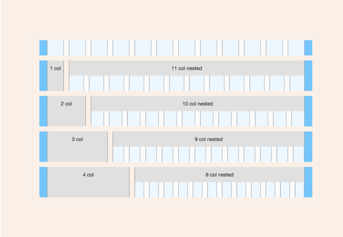
There are 12 columns in our responsive grid. Column widths change based on the size of the grid. A grid changes size by breakpoint. The column widths are defined by percentages rather than fixed values.
Gutters
Gutters are the spaces between columns. Gutters are a fixed value based on the breakpoint.
Margins
Margins are the space to the right and left of the 12 columns. They are a fixed value as the grid changes size. They can either be the same size as the gutters or greater when working with a larger screen resolution, such as the case with the Desktop breakpoint.

Breakpoints
The breakpoints are ranges, meaning the values are true from the minimum width up until the next breakpoint.
Column widths are a percentage, fluid and not a fixed size.
Data-backed Decisions
It took some time, even including Adobe themselves in confirming our analytics data, but we were able to get a clearer view of what types of devices our customers are using and how important mobile is. Using this information, we have come up with a new set of breakpoints, adding a breakpoint to cover larger phones and landscape viewports, as well as a much larger breakpoint at the desktop end for high-definition screens. We also discovered that a small percentage of users globally have smaller devices and therefore we encourage our designers to use 320px to make sure that American Express is ADA Compliant.
Fluid Vs Fixed
A fluid or responsive grid uses 100% screen real estate.
A fixed grid has a maximum size that the content is contained within, called a max container. While the screen can be resized larger, content will stop filling the space, causing the content to remain unchanged within each breakpoint range.

DLS v7 will offer a combination of both a fluid and a fixed grid. The grid will be fixed at the smallest breakpoint of 320px, then become fluid until the X-Large breakpoint, at which point it will become a fixed grid at 1440px. For wide screens, we have introduced a breakpoint of 2552px which will support extra wide screens.

| Minimum Width | Breakpoint | Margin | Gutter | Grid Width |
|---|---|---|---|---|
| 320px | Min | 16 | 12 | 320px minimum |
| 568px | X-Small | 16 | 16 | 100% |
| 800px | Small | 24 | 16 | 100% |
| 1024px | Medium | 32 | 24 | 100% |
| 1280px | Large | 40 | 24 | 100% |
| 1440px | X-Large | 40 | 32 | 1440px fixed centered |
| 2552px + | Max | 48 | 40 | 2552px fixed centered |
Margins are fixed sizes until the X-Large breakpoint, when it becomes centered on the device with a X-Large container of 1440px.
Default Padding
Default padding has been the cause of some major confusion between designers and developers when building out their designs in v6 and earlier versions of the DLS. Therefore, the new grid will no longer require default padding inside a max container.
Feedback
We want to hear from you! Are you excited about moving to an 8x responsive, fluid system or have questions of the impact on your team’s work? Will you be using the new landscape phone breakpoint of 568 for your design mockups? Does our largest, desktop breakpoint container suit your product needs? Let us know on Slack or by emailing dls@aexp.com.
Questions?
Connect with the DLS Team on Slack or by email.
Resources
Check out additional resources.
