Japan Internationalization
Japanese internationalization ensures that digital experiences are culturally, linguistically, and visually optimized for users in Japan.
Overview
Designing for the Japanese market involves more than just translating text — it requires thoughtful localization that respects cultural norms, language structure, visual preferences, and platform-specific expectations. Japanese internationalization encompasses adjustments in typography, date and currency formatting, layout, hierarchy, and interaction patterns to ensure that products feel natural and intuitive to Japanese users.
Adapting visual, typographic, and structural norms demonstrates cultural fluency and reassures Japanese users that Amex understands and respects their expectations.
Designing with Japanese Fonts
Characters
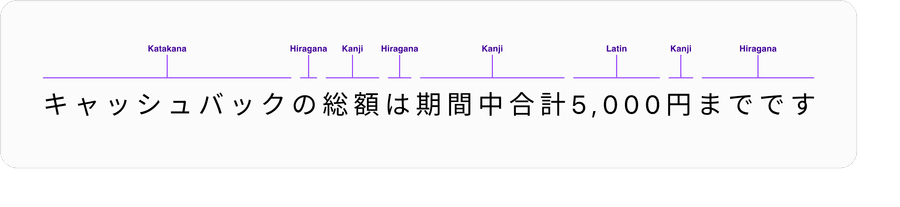
Japanese text is a blend of characters from four different writing systems – hiragana, katakana, Latin alphabet and kanji, often in the same sentence.
- Kanji, combine to represent most objects, ideas, and actions
- Hiragana, links and conjugates kanji and adds grammatical nuance
- Katakana, represents non-Japanese proper nouns, and concepts
Japanese characters are typically full-width and designed to “float” in the optical center of a square of negative space. Each glyph occupies a fixed 1 em square, so height = width.
Latin glyphs of varying widths sit on a common baseline, with ascenders and descenders reaching beyond the x-height, in contrast to the uniform square grid within Japanese type. When combined with Japanese, Latin characters appear too small and sitting too high or too low compared to their Japanese counterparts.
Font Stack
Use a font stack that prioritizes a Japanese or CJK font like Hiragino Kaku Gothic ProN, Yu Gothic UI, and Noto Sans JP before Latin only fonts like SF Pro or Roboto.
All characters are rendered in Hiragino Kaku Gothic ProN. Character height and weight are balanced.
2025/10/14までにTIAT DUTY FREE 羽田空港公式
- Prioritizes Japanese fonts first
- Ensures correct line height and baseline alignment for JA text
- Fall back to system fonts only if absolutely necessary
Inconsistent height and weight between Latin and Japanese characters due to mixing of multiple fonts.
2025/10/14
ま
でに
TIAT DUTY FREE 羽田空
港公式System fonts like San Francisco for iOS/macOS does not include native Japanese glyphs by default. On Apple devices, the system silently falls back to Japanese fonts like Hiragino Sans for Japanese text, which can lead to visual inconsistencies in height.
| Platform | Default JP System Font | Notes |
|---|---|---|
| iOS/macOS | San Francisco + Hiragino Sans | SF Pro is first, Hiragino fills missing CJK |
| Android | Roboto + Noto Sans CJK JP | Roboto first, then Noto Sans for Japanese |
| Web (Windows) | Yu Gothic UI | For Japanese UI; older: MS PGothic |
Most popular system fonts like SF Pro and brand fonts like Benton Sans do not support all four. If a Japanese font hasn’t been specified, rendering engines will mix characters from multiple fonts, resulting in uneven size, weight and spacing.
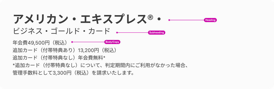
Type Hierarchy
Clear typographic hierarchy is essential in Japanese design to help users quickly understand and navigate content. Just like in Latin-based languages, visual hierarchy should mirror the content structure, making it easier for both users and search engines to recognize the main topics of a page.
Proper use of HTML heading tags—such as assigning the page title as an <h1>, subtitles as <h2>, and so on—is crucial. This not only improves SEO but also ensures that assistive technologies, like screen readers, can accurately communicate the page structure to users with visual impairments.
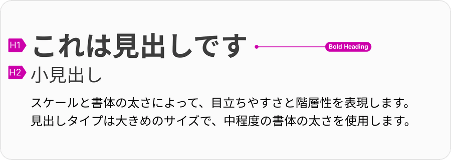
Title text should be bold and noticeably larger than body text, helping users quickly orient themselves when scanning or skimming a page. In Japanese text, where dense characters can make content feel visually uniform, it’s even more important that headings stand out. Consistent and intentional hierarchy improves readability, accessibility, and overall user experience for Japanese audiences.
Text Formatting
Line Height & Line Length for Body Text
Japanese text tends to be 20–55% longer than English due to the nature of the language—complex kanji, kana, and the absence of spaces between words. This creates a denser visual texture compared to Latin-based languages. To maintain readability, it’s important to apply slightly looser line spacing, which gives each character’s shape and outline more breathing room and reduces visual fatigue, especially in longer content. Set a minimum line height of 1.5 (150%) for Japanese body text. This allows the text to breathe and improves scanning without feeling too cramped. Line heights suitable for English are often too tight for Japanese.

In addition to line height, line length plays a crucial role in readability. Because Japanese characters carry more visual weight than Latin letters, excessively long lines can make reading feel tiring and scanning more difficult. To optimize readability:
- Keep line lengths between 40–50 characters per line for Japanese text
- Use a maximum paragraph width of 600–700px on desktop to maintain an optimal reading experience Applying both generous line height and controlled line length helps create smoother reading rhythms, clearer text blocks, and a more comfortable user experience for Japanese readers.
Left-Aligned Text
Japanese text should be left-aligned to maintain readability, natural flow, and consistent visual rhythm, while center alignment should be reserved only for titles, headings, or short taglines where balance and emphasis are needed.
Usage of List
Make sure to support and use true ordered or unordered list for bullet points (For example <ul> or <ol> in HTML). Align with the local team for correct usage and maintenance.
When making localization adjustments to our components and semantics, it is important to maintain our standards of accessibility.
Not using CSS-based list styling for bullets will create inconsistent alignment and spacing, as well as accessibility and responsive behavior issues. It’s also harder to maintain consistent usage over many pages authored by various partners.
Truncation
It is important to remember to align your text properly within the design system components to ensure the text doesn’t truncate. Truncation reduces readability, makes the page less intuitive to use, and appears unprofessional.
- Rewrite the copy so it doesn’t need to be truncated (For example, instead of “Register Card…” use “Card Registration”)
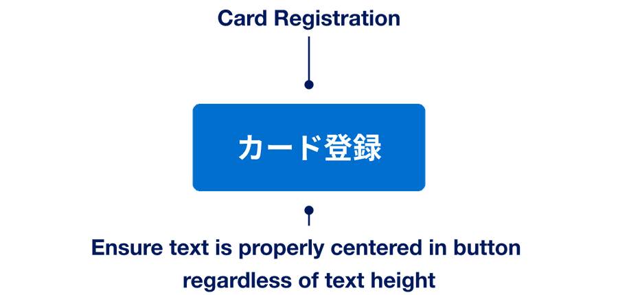
- Truncate text when it’s too long to fit

Unnatural Line Breaks
Some titles and labels contains mid-word line breaks that disrupt readability and leave the UI feeling unpolished. English usually avoids this because spaces and optional hyphens tell the rendering engine where to wrap, whereas Japanese doesn’t offer such hints, so breaks can fall almost anywhere and break words or phrases.
- Collaborate with the local team to keep labels and titles short, rewriting and setting guidelines as necessary.
- Add manual line breaks when appropriate
- Consider implementing an automatic line breaking tool such as Budou
- Rely on the rendering engine to wrap text
Date Formatting
In Japan, kanji-formatted dates are considered formal and culturally appropriate in official or polite contexts, while slash-separated dates are preferred in informal or data-heavy applications. To align with local conventions, use both formats as appropriate—balancing space efficiency, scannability and tone.
Kanji Format
Basic principles of Japanese date format:
| Counter | Description |
|---|---|
年 | Year |
月 | Month |
日 | Day |
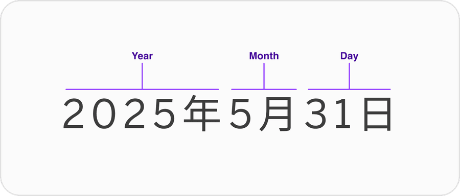
Use kanji format for stand-alone dates appearing in headings and sentences. Year is optional when obvious.
2025年5月8日
Don’t use leading zeros with kanji formatting.
2025年05月08日
Slash Format
Use slash format for data tables or lists or when displaying dates related to data. Add leading zeros, especially in list views, to enhance vertical alignment and scanning. For slash-formatting, include the year to avoid ambiguity between date and month.
2025/05/08
2025/5/8
Range Indicator
Depending on the date-formatting used, use the proper dash.
Kanji uses wave dash.
2月20日〜 3月19日
Slash uses standard dash.
02/20-03/19
Don’t use long dash when displaying range in slash format.
02/20 ー 03/19
Currency Formatting
For a more formal appearance, write yen in Kanji (円) after the amount. Adjust the size and contrast of 円 to put more emphasis on the number.
10,000円
¥10,000
Questions?
Connect with the DLS Team on Slack or by email.
Resources
Check out additional resources.